

GuideMe Mobile App
What if there was an easier way to connect local skiers/riders with non-locals to help those skiers/riders get the most out of their experience in an unfamiliar place?
GuideMe is an app that pairs local skiers/riders who are very familiar with a particular mountain with visiting skiers/riders who are unfamiliar with said mountain. The purpose of GuideMe is for visitors to hire locals at an affordable rate, who can safely guide the visitor around the mountain based on their preferences of what type of terrain they want to ski/ride.


Brief

Design an End-to-End mobile app. This app was conceived last winter and after numerous experiences, positive and negative, skiing in different locations it was time to dive deeper into this idea. As an iOS user I chose to construct the app with Apple’s Human Interface Guidelines to make sure that users would have a coherent experience.
Duration: 80 hours (2-weeks)
Roles
UX Designer: Low fidelity sketching, low fidelity wireframes, high fidelity wireframes and prototypes
UX Researcher: Secondary research, competitive analysis, user interviews, survey and usability tests
UI/Visual Designer: logo, color palette, branding, style guide, and overall visual appearance
Tools Used
Pencil and paper, Sketch, Google forms, InVision, Gloomaps, FlowMapp
Overview
Have you ever been lost (…anywhere) and wished you had someone who could show you where you wanted to go? Or they could offer suggestions if you didn’t know where you wanted to go?
Now imagine this concept taking place on a ski mountain.
I’ve been a skier since I was 6 years old and I’ve skied at 20+ mountains in three different countries. Each time I visited a new location I’d have a similar experience. It usually took one to three days (depending on the size of the resort) to get my bearings. Once I knew where I was going, it was time to leave.


While exploring new places can be rewarding, it can also be frustrating. For example, say you may make a wrong turn and end up in a different area than you wanted to be in. Maybe the trail is above your skill level, maybe it too easy? Either way not knowing where you are going can lead to issues.
GuideMe came about after many about positive and negative experiences while visiting new mountains as well as discussions with fellow skiers and riders about their travels.
GuideMe aims to solve these problems and be a useful tool for locals and guides alike.
What about a trail map?
You may be asking yourself, why can’t skiers/riders just use a trail map? It’s how everyone has been navigating the mountain since 1988 when the pocket sized maps became popularized.
The issue with this trail maps is that they are simply a 2-D representation of a real 3-D mountain. A trail map doesn’t show you pitch or obstacles (trees or cliffs) or weather patterns. Those intricacies are learned from experience on the resort, they can’t be replicated on a piece of paper.
This is where GuideMe comes in and overtakes trail maps as the best way to navigate around a mountain. The local guides know the mountain like the back of their hand, so much so that they know which runs to go on in the morning versus the afternoon. Certain trails are better earlier in the morning because of how crowds typically flow and some trails are better in the afternoon because the sun warms them up later in the day.

Trail maps are designed to fit in your pocket, therefore the text and details are extremely small.
Research
During this process it was important to not design for myself. Although I would be a primary user, my own personal experience would not be enough upon which to base all design decisions. Therefore, I needed to validate my assumptions and dig deeper into whether or not the unknowns would thwart this app from being a feasibly business. To dig deeper into the industry, I utilized secondary research, user interviews, as well as a survey to confirm or deny my assumptions.
Assumptions/Unknowns
This product would primarily be for expert skier/riders.
While consumers would want to use this app, locals wouldn’t want to show strangers their secret spots.
How would we handle safety?
Would guides need any certifications?
Secondary Research
Conclusions
Outdoor and adventure based guided experiences are rapidly growing
Limited choice or personalization on guided adventures
Guided trips or hiring a guide for a day are extremely pricey
Guiding services are ran by ski stores local to ski mountains but have limited resources
Guiding services primarily focus on avalanche safety and outdoor education

Concerns
While GuideMe has the potential to be an open marketplace for both guides and visitors there are legal concerns surrounding this concept. The major concerns are 1. Guiding on public land in the United States is incredibly regulated and 2. the person receiving money for that service needs to have a permit.
Competitive Analysis

Conclusions
No direct competitors. Other snow-sports oriented apps focus on weather, mountain information, or booking lessons rather than hiring a guide/ski buddy.
AirBnb experiences made 1/2 million dollars in their first year (2016).
Other outdoor apps are utilizing this same concept outside of the ski/snowboard industry.
User Interviews

Spencer | 29 | skis 100+ days a year

Mona | 65 | skis 10-15 days a year

Kevin | 29 | rides 5-10 days a year

Ben | 30 | skis 10-15 days a year
Goals
Efficiently find desired terrain
Safely find desired terrain
Confidence to push yourself on new terrain
Feel as though the trip was a worthwhile experience
Get a feel for the mountain quicker
Mitigate poor weather by having local knowledge of weather patterns
A knowledgeable person to accompany them around the mountain
Pain Points
Putting yourself in a dangerous/uncomfortable situation while exploring unknown areas
Not being confident in the terrain - IE. landing of a drop
Not being able to find the terrain you want to ski/ride, but knowing it exists
The feeling that you spend more time waiting in lines than skiing/snowboarding
Feeling like you didn’t get the most out of your day
Survey
With a limited time-frame, I thought a survey would be the best way to gather more data. The survey responses helped validate my learnings from the user interviews.
Quotes
Conclusions
“Improve efficiency when exploring new places”
“I'd get more out of trips to new places”
“If it was reasonably priced and could book per hour that’d be amazing”
“It’d be awesome to not slow down friends and have someone to explore with”
11 out of 12 respondents ski/snowboard in new/unfamiliar locations at least a few times a season
Primary Reason: Try something new
11 out of 12 respondents have not hired a guide
Primary reason: the cost
When visiting a mountain, respondents said their experience was heavily influenced by another person. Meaning they relied on another person for directions of where to ski/ride either asking for directions or following a friend rather than just looking at a trail map.
Design Decisions
Here are a few of the design decisions that arose from my research.
Consumers wanted the ability to browse through different guide options and filter based on preferences.
Consumers wanted a chat feature in which they could message with a potential/booked guide before their trip.
The solution must be easy to use and affordable.
I used design patterns similar to AirBnb and Yelp. They are highly credible resources in the tourism/services industry and their apps are optimized for conversions.
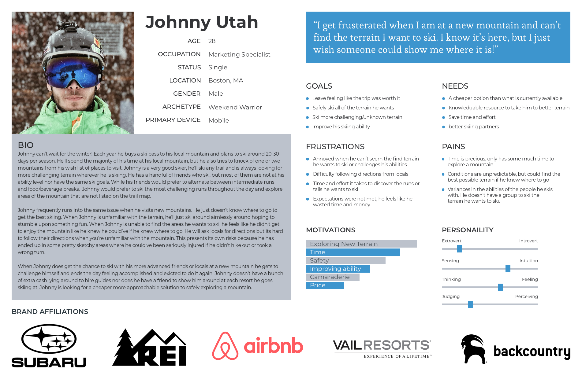
Persona

Information Architecture
While designing an end-to-end application, it was paramount to map out a sitemap and user flow prior to jumping into the design phase. I looked to Yelp, AirBnB, and Uber for how they structured their applications. Similar to these apps, I wanted users to be able to accomplish their task easily, which was to find and book a guide. For that reason, the home screen was designed in a way to prompt users to start searching for a guide.
Sitemap
User Flow


Low Fidelity Sketches
Onboarding Concepts
I wanted to keep the onboarding flow as simple as possible for users to reduce any drop-off. During onboarding users would answer some questions that would begin to fill out their profile such as: What is your ability level? Do you ski or snowboard?
Instead of having users type in their own answers to onboarding questions for concepts such as ability level and interests, I wanted users to select from pre-selected answers. I was exploring whether it’d be a better experience for the user if the onboarding questions were on a single scrolling screen (second sketch) or if each question should be on a single screen (third sketch).


Homepage Concepts
Similar to Yelp’s home page which is extremely simple, the concept in the first sketch was to only give the users a choice to search, use a map or go directly into a results page for mountains/guides.
The remaining four sketches are different ideas on how a user may want to search for a guide. Would they want to start by seeing guides at a specific mountain or would they want to just see the guides right away? Would they want to access filters on the home page to filter results or should that be deeper down the funnel?


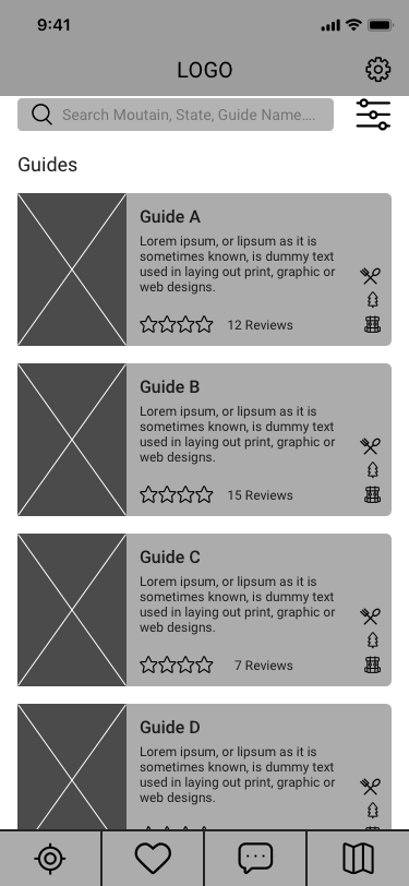
Search Results & Guide Profile
For the search results and profile concepts I emulated design patterns from Yelp and AirBnb. These two screens are a representation of what search results may look like (first sketch) and what a guide’s profile would look like (second sketch). Each rectangle in the first sketch would feature an image of the guide/mountain along with a description, icons as information indicators, and a heart icon to save the result to a saved list.


Low Fidelity Wireframes
Onboarding & Search
GuideMe starts with an onboarding flow to have users create a basic profile and select whether or not they are a visitor or a guide. Once the user completes the sign-up flow they are then brought to the home screen.
Users then have multiple way to find a guide. They can to swipe left and right to see local mountains and/or guides. There’s a search bar if a user wanted to search by city, state, mountain or guide. If a user was to click on a mountain, they’d be shown all of the guides for that mountain. Users can use the filters to find the right guide based on their preferences. The filters include price, discipline, ability level, and interests (seen here as expertise).


Guide Profile & Booking
To book a guide, the user must go through the guides profile. The guide profile consists of photos, a short bio, reviews, their calendar and any additional details they want to share about their service.


Tap Navigation, Settings, & Profile


Design
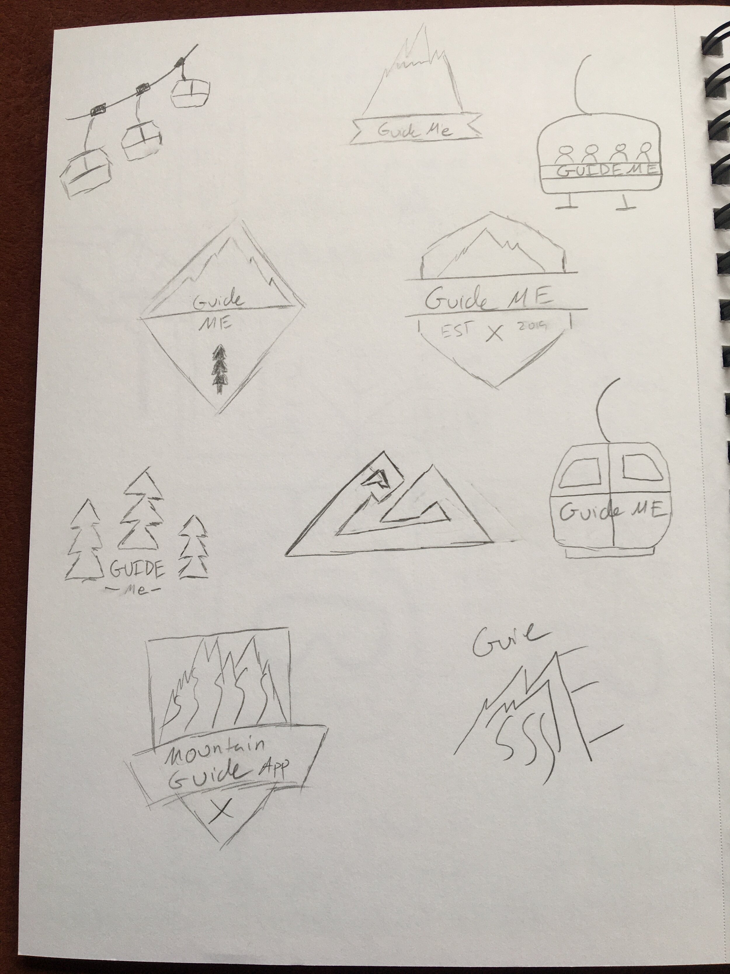
Logo
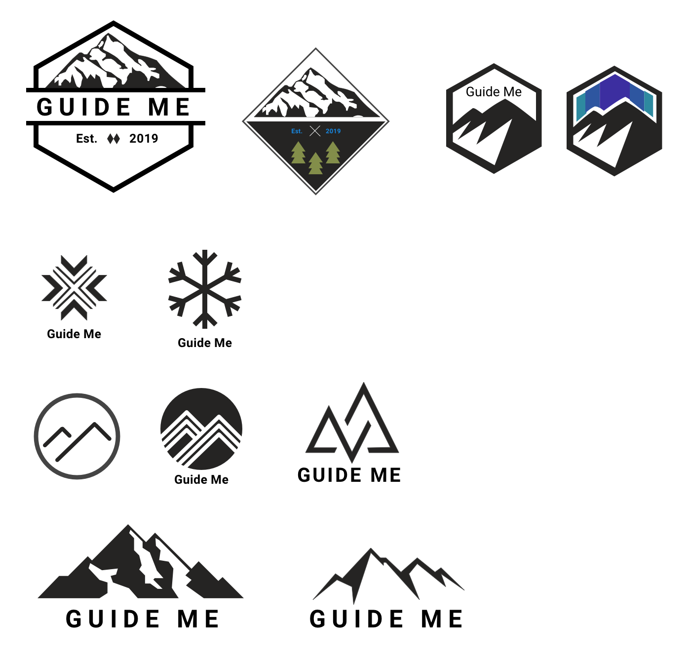
As a snow-sports app I wanted to the logo to harken back to the outdoors. I sketched ideas around snow flakes, ski equipment, chairlifts, and mountains.
I chose the hexagonal mountain logo due to its simplicity and ability to be scaled up and down while retaining its shape.

Color Palette

The blue brand color was chosen because blues signify trust and the relationship to the outdoors and snow.
The dark grey and white shades were chosen for readability
The gradient was chosen as a highlight color to add a bit more vibrancy throughout the app.
High Fidelity Wireframes


Test & Iterate
Usability Tests

Details
5 Usability Tests
3 males / 2 females
Ages: 28 - 65
Task Completion Rate: 100%
Error Rate: 10%
Conclusions
Testers found the app intuitive and smooth.
A few elements such as the sign-up flow and filters were confusing for testers.
Users desired more context/directions for certain titles and headings to improve clarity of the intended tasks on each page.
Users wanted a confirmation screen after booking a guide to indicate that the transaction was completed
Users wanted more details around what happens after a guide is booked and before their trip, which was added to the trip details page
Iterations
Changes
Improve clarity of sign-up flow by adding directions and progress indicators
Add home button to tap navigation
Improve titles & directions for filters, sign-up and booking flows
Make confirmation message and trip details page more robust and separate from booking process
Future Improvements
Improve visual design
Test improvements and refine
Add a ‘guides available now’ feature
Add trail-maps for mountains
Expand upon interest offerings

Key Learnings + Next Steps
Key Learnings
When creating something new, look to established sites/apps for design patterns as inspiration. Since the concept of this app was combining skiing with AirBnb, Yelp, and Uber I looked to these sites/apps to see how they handled concepts like booking, profiles, confirmations and tap navigation.
Verbiage and directions need to be extremely clear. While designing I struggled to come up with single straightforward titles for the headings of my filters page, the sign-up flow, and booking process. Words such as expertise, client, and slots were unclear to testers. This led to me adding context clues such as directions or additional words to the titles.
Don’t limit yourself with your color palette. I prefer to design with less than more when it comes to selecting colors. I was only using three colors (brand, font, and background) while working on the mid fidelity wireframes, but I decided the app needed more vibrancy, which led to the gradient acting as the highlight color throughout the app. I chose the gradient because I didn’t want another flat blue, but rather something more punchy. I’ve considered experimenting with a retro color palette in the future.
Next Steps
Test → Conduct more usability tests based on the changes made during the first phase of iteration focusing on the clarity of the directions.
Iterate → Make any necessary design changes based on the feedback from testing.
Repeat (if necessary) → Repeat testing and iteration until the product/new feature is at a point where it’s ready to be shipped.
Refine → Put the finishing touches on for launch.
Get in touch!
If you would like to get in touch with me about this project, working together, or just want to say hi, hit the button below!