Adding a Feature to Venmo
What if there was an easier and more widely accepted way to split a check amongst a group of diners, while avoiding the social stigma of just paying for what each person ordered or consumed?
Using Optical Character Recognition (OCR) Venmo now gives users the ability to take a photo of their
receipt and convert the image into machine-encoded text on their device, and then split checks
more effectively.
Brief
I was tasked with designing a feature within an existing product. I chose to add an OCR check splitting feature to Venmo. Because Venmo is such a simple, efficient and widely used app, it was paramount to make the new feature just as easy to use. Not only did I need to maintain the existing look of the app, but also the feel of the established interaction patterns. As you will see, the new feature fits right in with the existing application and re-uses existing components to make sure the new experience is seamless with the existing product.
Duration: 80 hours (2-weeks)
Roles
UX Designer: low fidelity sketching, mid fidelity wireframes, high fidelity wireframes and prototypes
UX Researcher: secondary research, competitive analysis, user interviews, survey and usability tests
UI Designer: seamlessly integrating a new OCR feature into the existing form of Venmo
Tools Used
Pencil and paper, Sketch, Google forms, InVision, Gloomaps, FlowMapp
Overview
Have you ever been to a restaurant with friends and paid for more than your own meal?
For example, what if you didn’t drink alcohol with dinner or you ordered a low priced appetizer instead of an expensive entree? What if the people in your party ordered drinks, appetizers, and entrees? How do you handle the situation when you are being asked to pay for food that you did not order or eat?
Today the most common way to split a check is to split it evenly amongst all the members in your party, regardless of who ordered what. While this tactic is easier for the group as well as for the server it can easily create an awkward situation or dissension amongst friends.
To remedy this situation, I designed a feature that would allow users to easily split a check based on what each individual ordered/consumed and request payment directly within Venmo.
Research
Kicking off the design process
When considering what feature I could add within an existing application to help improve it or solve for a deficiency I started by looking into the financial industry. My preliminary research looking into what potential features I could design to improve my personal bank’s app or Mint was inconclusive.
With the deadline looming and no real progress made thus far, I took a moment for a brainstorm session to consider how I could solve a problem of my own. Roughly 36 hours into my two week timeline I conceived the Split with Group feature. To quickly validate my concept and move forward with the project, I solicited feedback in the form of rapid interviews.
Concept Validation
I spoke with seven different people for ten minutes or less regarding their use of Venmo and whether or not they would use an OCR check splitting feature.
Of the seven people I spoke with, the users ranged from “everyday” users to “rarely do they use Venmo” but 100% of the interviewees said they saw value in a more automated and efficient way to split a bill.
Competitive Analysis
Conclusions:
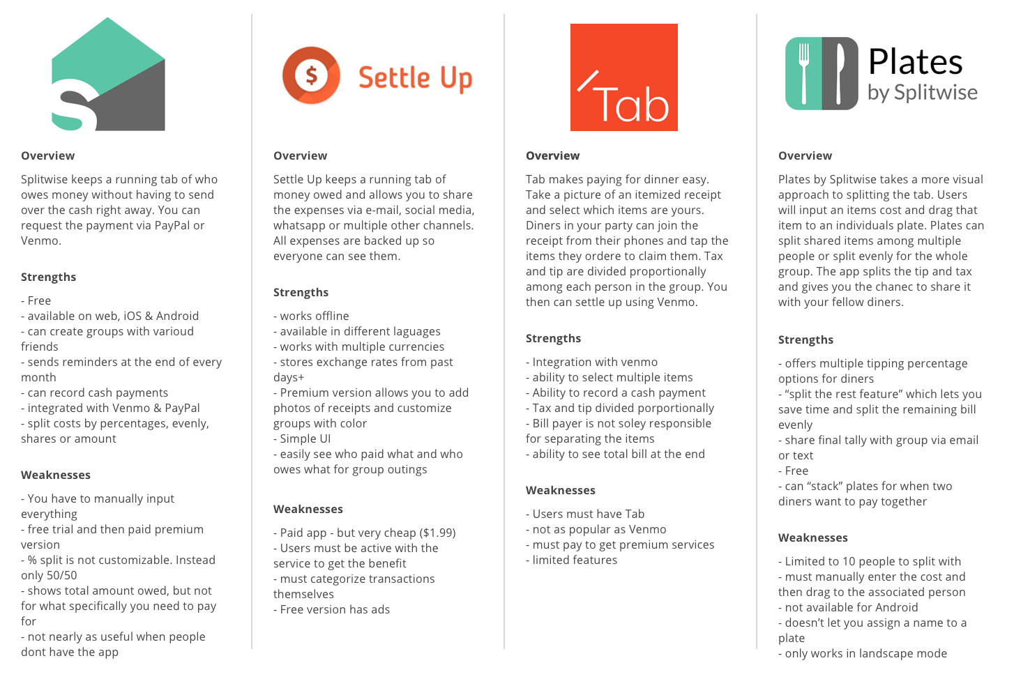
These bill splitting competitors don’t have the ability to transfer money natively. They either don’t support money transfers or they push you to Venmo or paypal.
The competitors are solely a tool to record, split and total group costs while on vacation, paying for bills, or going out to eat.
In order to transform a picture of your receipt into a digital list you must pay for a premium subscription. Otherwise you must enter all of the individual items manually.
Splitwise is the only app that has a loyal following.
User Interviews
Details
4 interviews
2 males / 2 females
Ages: 28 - 35
Daily to yearly Venmo users
Goals
Save time and effort when splitting up a check
A process that doesn’t involve the server
Reduce costs and avoid awkwardness
A simple process/solution, so that it will be adoptable by a group
Integrated within an existing app that people are already familiar with
Being able to comfortably order what you want to eat and/or drink
Pain Points
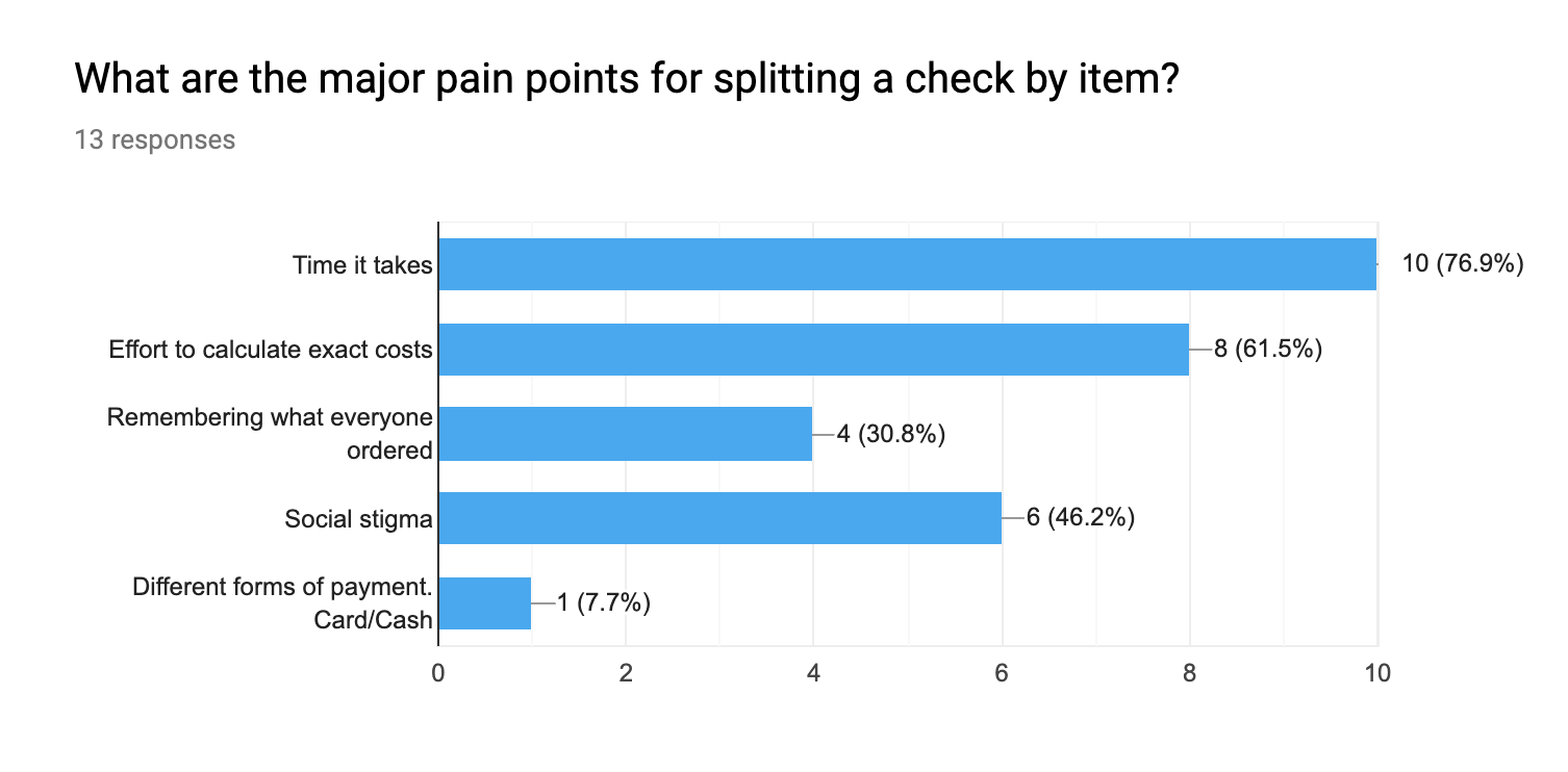
The time and effort it takes to split a bill based on what everyone individually ordered
Social Stigma: the feeling or being though of as cheap when you don’t want to split the check evenly
Don’t want to be the only one to speak up / go against the grain
Not wanting to go out with certain people or sometimes at all based on their ordering habits
Costs add up when you are always paying for someone else’s food
Survey
To further validate the conclusions from my user interviews, I turned to a survey to get a larger set of data. The responses from the survey further cemented the use of this new feature as well as some interesting information on how users typically split their checks.
Quotes
“I don’t drink much while other people do and I don’t want to pay for something I didn’t consume.”
“I could see the "pay exactly what you owe" being preferred for people who don't drink or generally order smaller dishes (or, being frustrated by dining with people who always order a filet mignon and 10 cocktails).”
Persona
Information Architecture
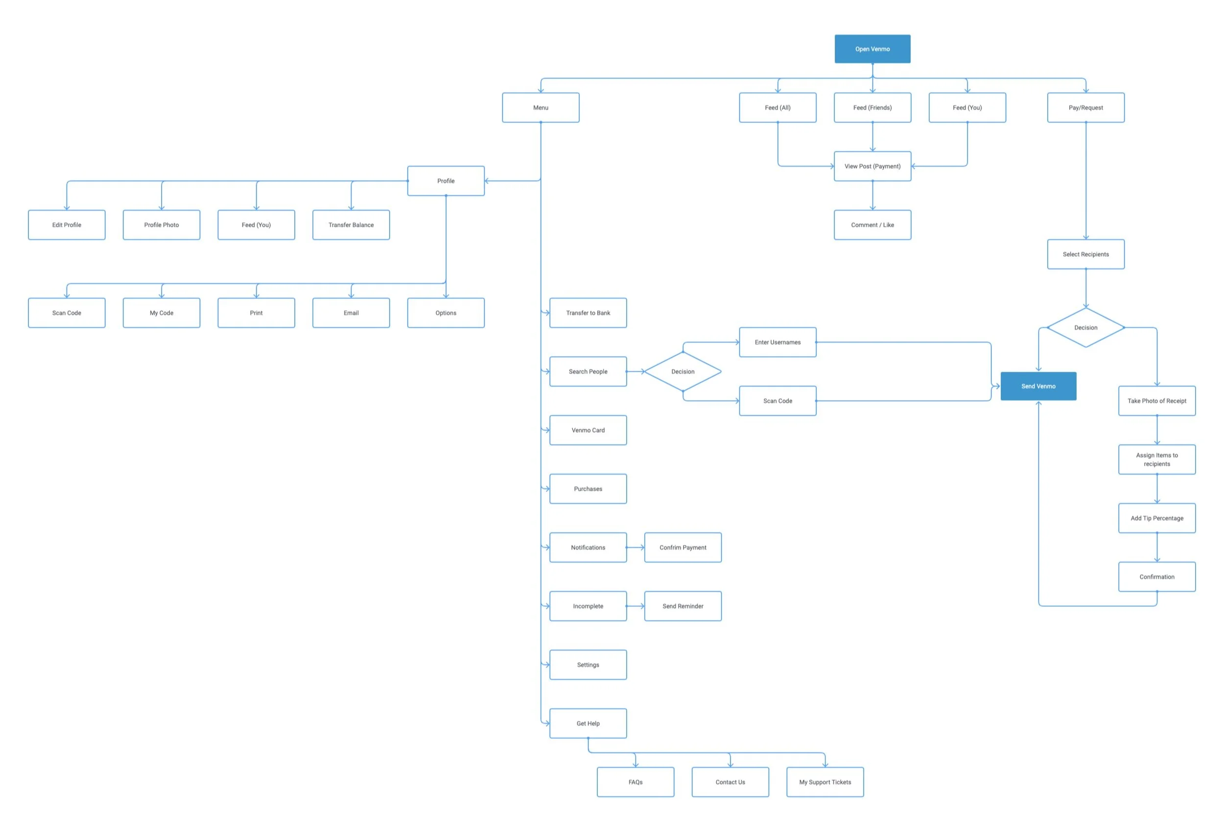
To help identify where the Split with Group feature would fit within the existing Venmo architecture, I mapped out a task flow, sitemap and user flow to help me from deviating from the Venmo experience. I used these artifacts to focus on how to integrate the new feature within the existing application while I sketching my low fidelity wireframes.
Task Flow
Sitemap
User Flow
Low Fidelity Sketches
Feature Initiation
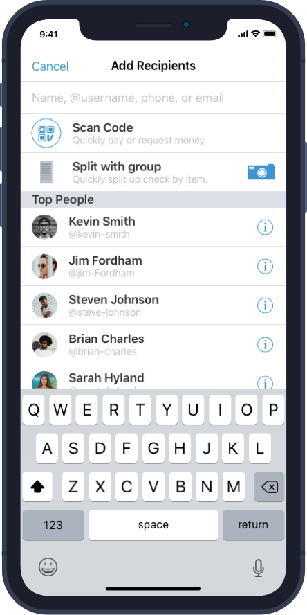
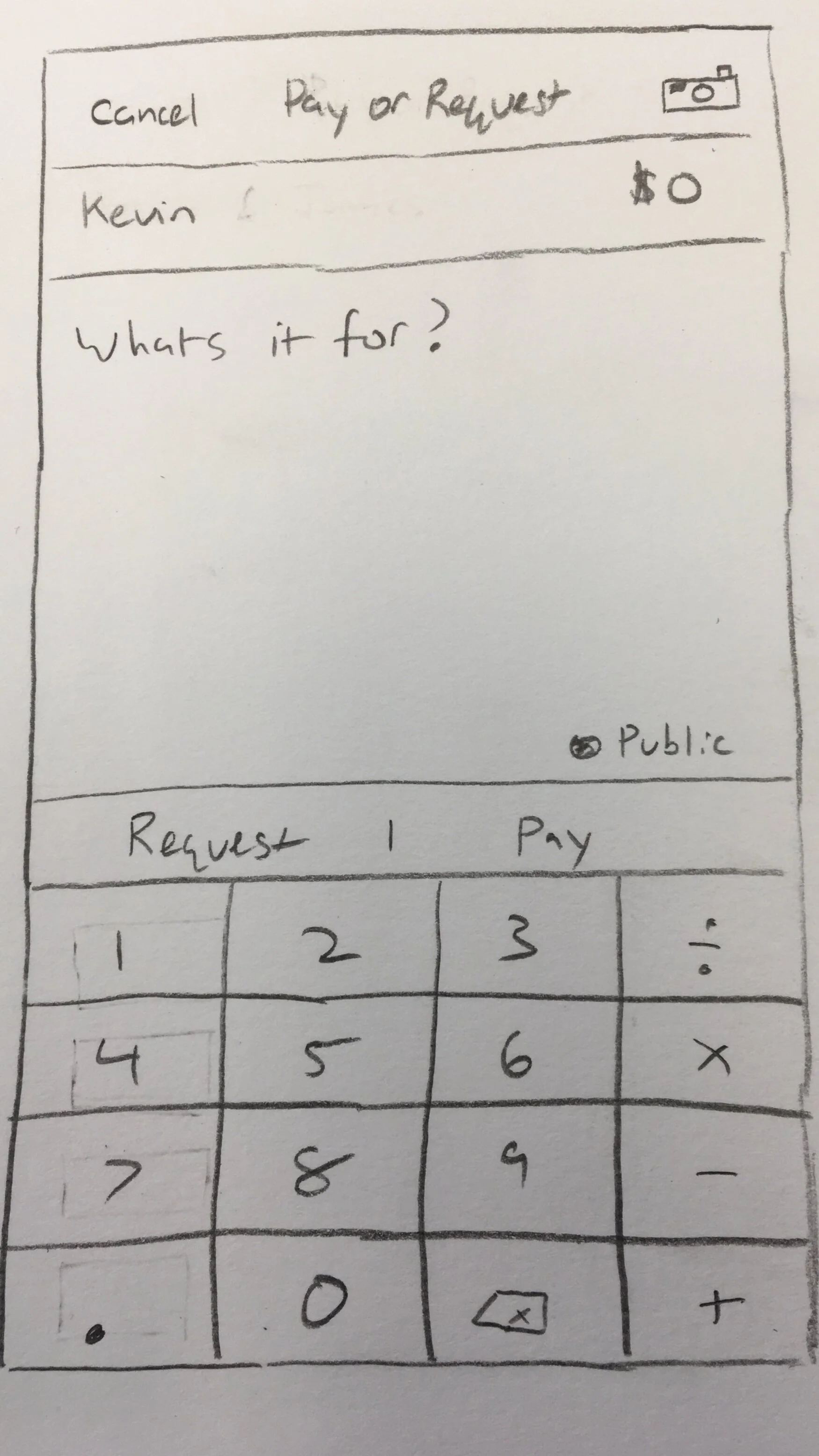
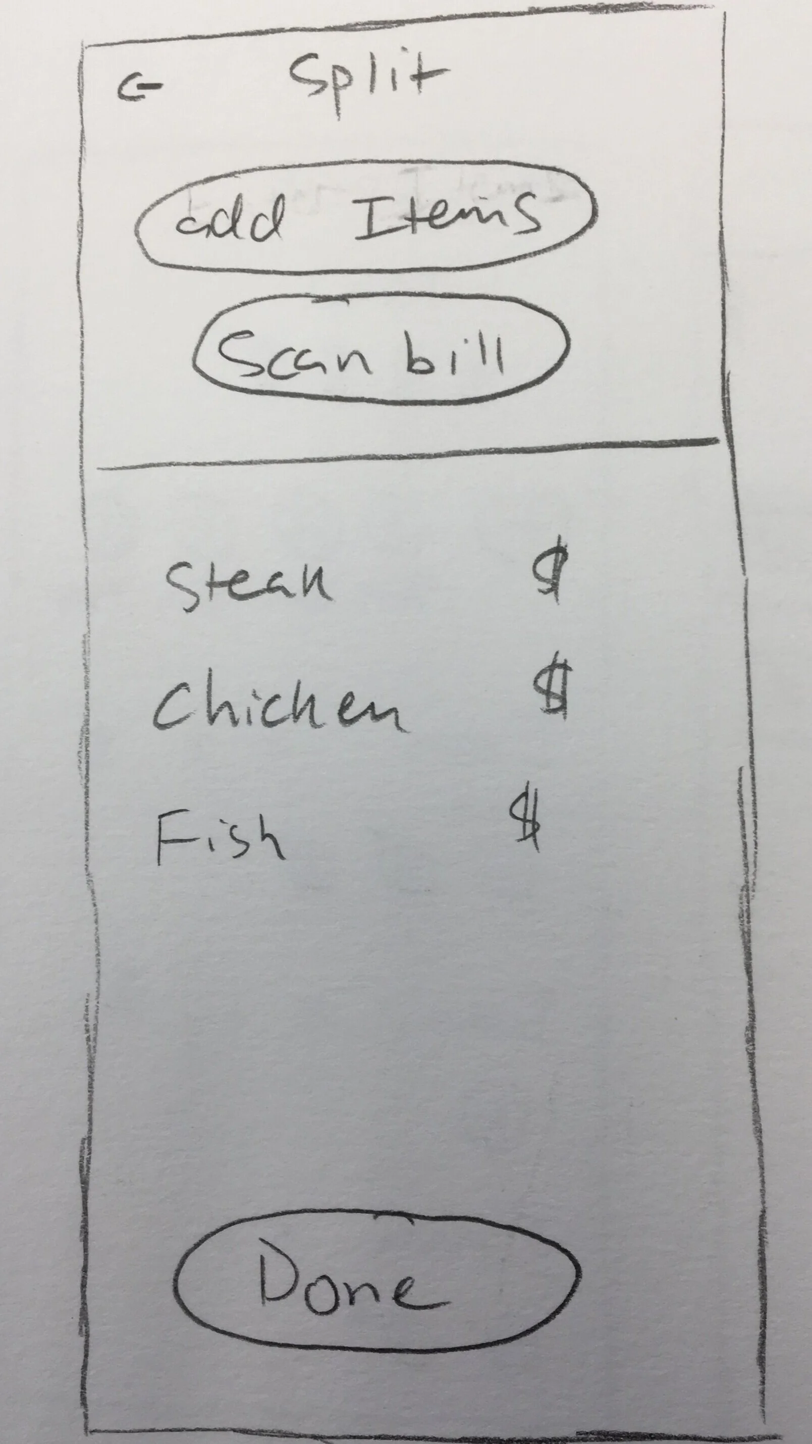
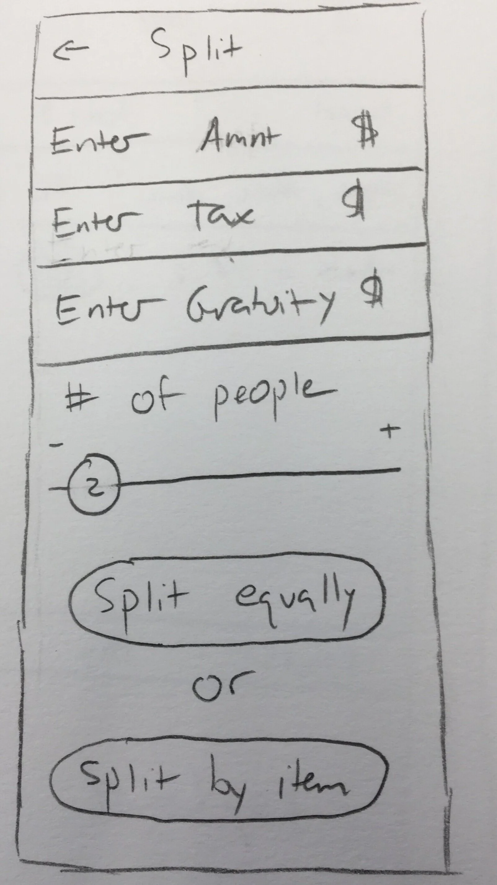
Here are four different concepts of how to initiate the new Split with group feature. The first three feature a camera button to prompt the user to take a photo of their receipt within the primary request/payment screen, while the last one features a split with group button to initiate the feature when selecting your group from the “Add Recipients” screen prior to making a Venmo request/payment.
To scan or not to scan?
The first sketch shows the act of taking a photo of the receipt, while the second and third sketches give the user more options. In the second sketch, the user can scan their receipt or add items manually. While in the third sketch, they can simply enter the amount, tax, gratuity, number of people to split with and then choose to split evenly or by item.
Splitting the Bill
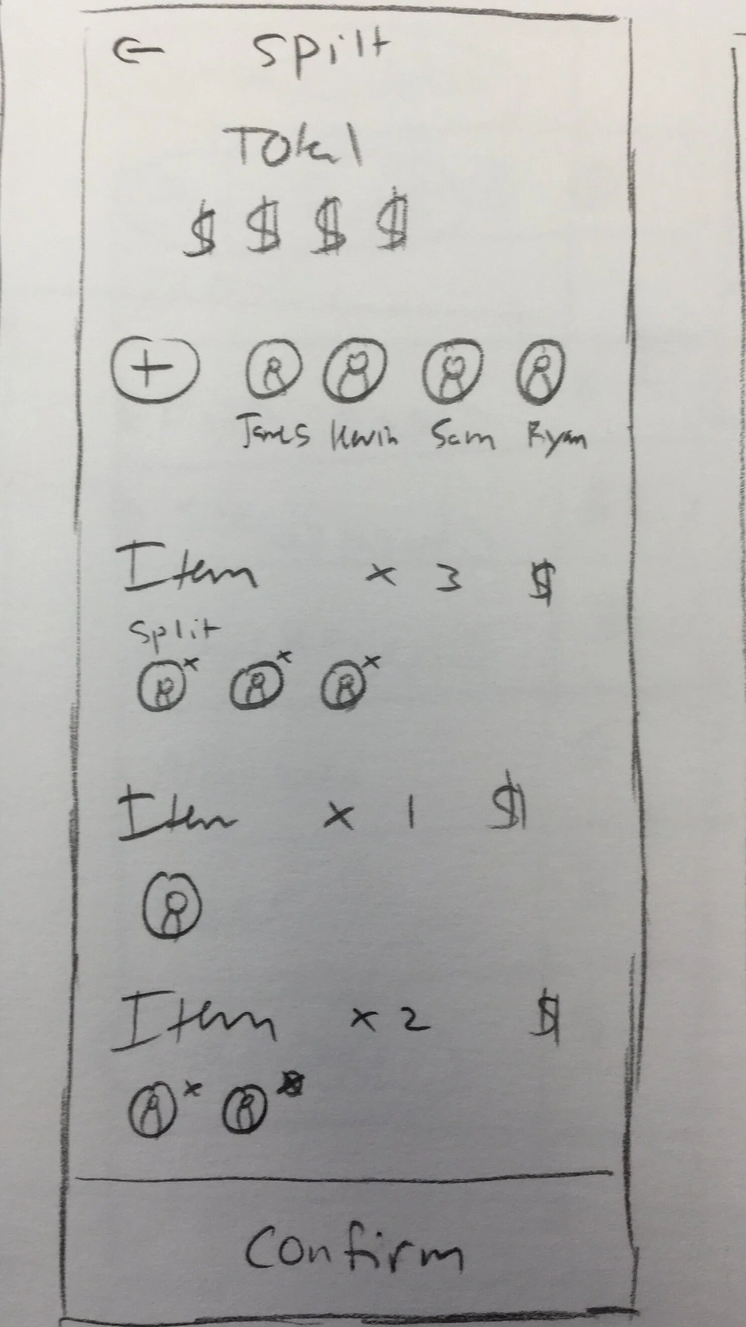
Once the user has either taken a photo of their receipt or they have added items manually, what should that look like? Should each person select items individually? How can I show items that are shared amongst the group?
Requesting Payment
These are some concepts for what the final request screen would look like. Should it show each person’s itemized receipt? Should it just show each person’s total? Should it be a combination of the two concepts?
Design
During the design phase, I refined the details of my mid-fidelity wireframes to match Venmo’s current state, including brand colors, design components, profile images, accurate icons, and improving padding and readability across the feature.
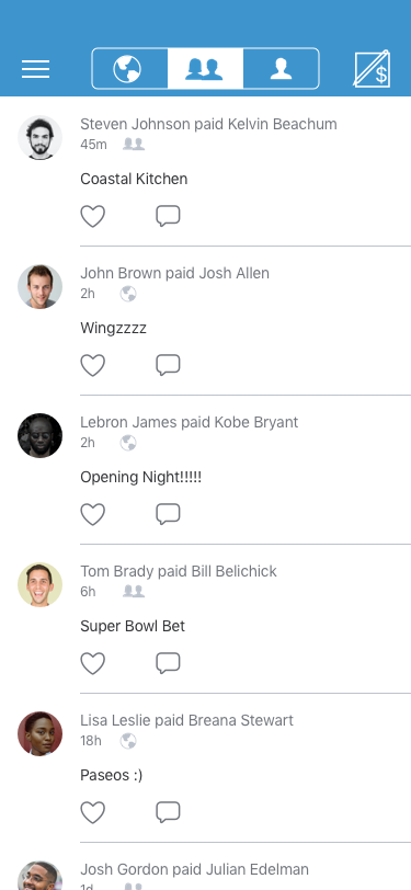
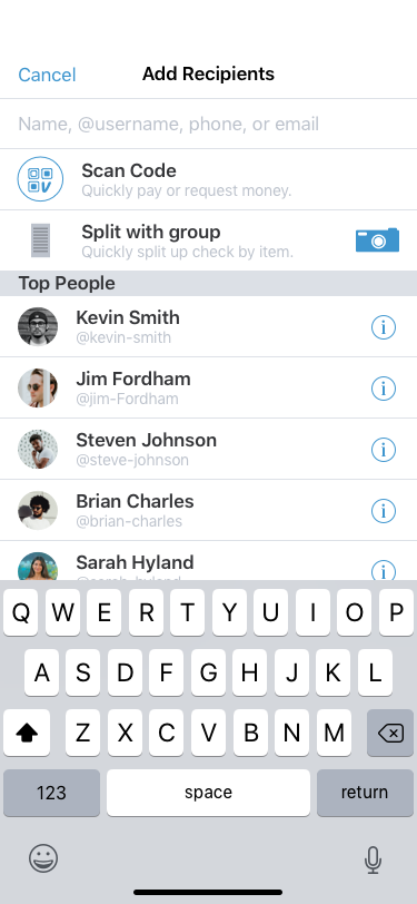
The Split with Group feature initiation takes place on the second screen of the traditional Venmo task flow. First, a user taps the Venmo request/pay button in the top right hand side of the screen. Then the user has the option to follow their traditional user flow or initiate the new Split with Group feature. (Home —> Feature Initiation)
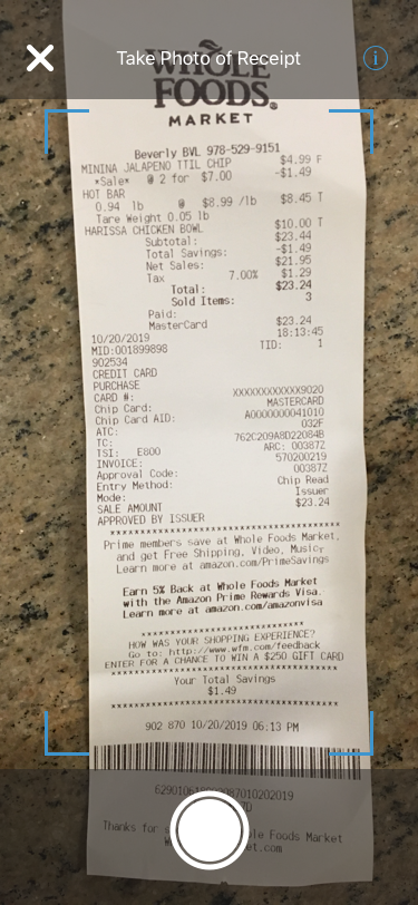
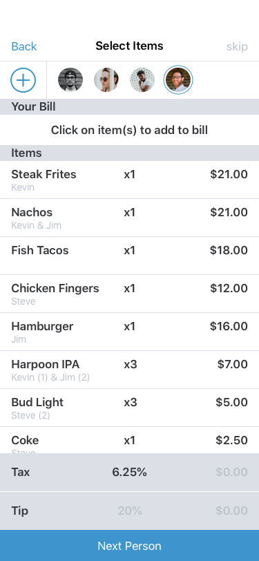
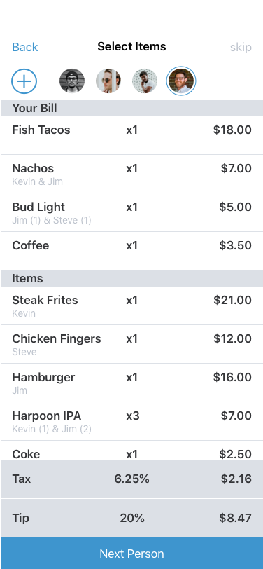
Once they select the Split with Group feature, the user scans the receipt and is able to individually select items and assign them to each person in the group. (Take photo of receipt —> Review Receipt —> Add items to bill —> Items added)
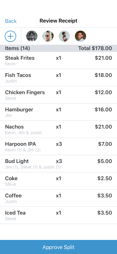
Names are then displayed underneath each item to denote who has accounted for each item. (Review Split)
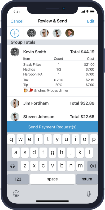
On the final screen, everyone’s personalized totals are displayed and then the primary user can send a Venmo request to their friends. (Send Venmo Request)
High-Fidelity Wireframes
Test & Iterate
After the initial high fidelity designs were completed, it was time to test the feature to get some feedback. This has always been my favorite part of the UX process as it gives the designer/team quick and actionable feedback on how to improve the product.
Usability Tests
Details
5 Usability Tests
2 males / 3 females
Ages: 21 - 35
Task Completion Rate: 100%
Error Rate: 20%
Conclusions
Overall the testers found the new feature to feel native to Venmo.
Some simple improvements to user directions and page titles, as well as the tax and tip flow would vastly improve customer experience.
Testers mentioned they wanted Venmo to make this a feature.
Iterations
Changes
The ability to add a photo from your library and split your check later, rather than needing to take a photo of the receipt and go through the whole process at the table
Move the tax and tip portion to the beginning of the user flow
Make the receipt editable in the instance the OCR technology doesn’t read something properly
Clarify titles and buttons to make the purpose of each screen more user friendly
Expand upon final screen - show an itemized list for each person’s total cost
Future Improvements
Improve upon the fun/social aspect of Venmo
Add more failsafes for errors
Give users the ability to enter a receipt manually
These screens show the ability to add text and, most importantly, emojis to your Venmo request, either personally or to the whole group. This is truthfully what makes Venmo Venmo. It’s the fun and social nature that users expect out of the experience.
Key Learnings + Next Steps
Key Learnings
Make a test plan first and let that guide your prototype. Initially I built a larger prototype that acted as more of a demo. This displayed the full capabilities of the feature including how users would handle edge cases. This led to some confusion for users during testing. In the future I would make sure to test the basic functionality before diving into more advanced user flows.
The user experience can always be improved. With a limited timeframe to deliver the project, I was only able to do a handful of usability tests. I gained some extremely valuable insights from those tests to improve the overall user experience. With more time I would have liked to test and improve upon the changes as well as my solutions for edge cases.
Design patterns only get you so far; it’s about user patterns. After observing the users during testing, it was clear that the design patterns I utilized for adding/deleting items from the receipt were confusing. The feedback from the usability tests helped me design a much more user friendly flow for adding/deleting items.
Next Steps
Test → Conduct more usability tests based on the changes made during the first phase of iteration, focusing on the fun aspects of Venmo on the final screen.
Iterate → Make any necessary design changes based on the feedback from testing.
Repeat (if necessary) → Repeat testing and iteration until the product/new feature is at a point where it’s ready to be shipped.
Refine → Put the finishing touches on for launch.
Get in touch!
If you would like to get in touch with me about this project, working together, or just want to say hi, hit the button below!


