
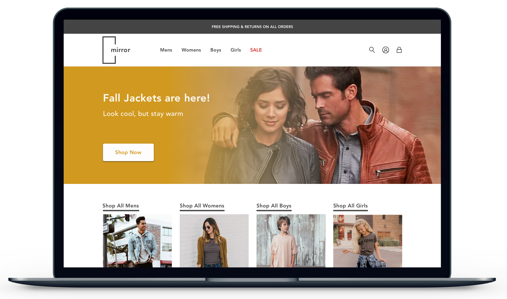
Building a Responsive Ecommerce Website

I redesigned Mirror’s logo and designed a responsive e-commerce website for mobile, tablet, and desktop use, thus giving the brand a refreshed look.

Brief
Refresh the branding of the retail clothing store Mirror and design a responsive ecommerce website. Mirror gave us a blank slate to work with regarding their logo, color palette, and website. All they asked was to deliver a modern, fresh and approachable look for their new online store that meets the needs of the business as well as their customers.
Background
Mirror is a quality clothing retailer that offers affordable clothing for the whole family. Mirror started in 1994 and to this day boasts 400 brick and mortar stores in 32 countries. Up until recently, Mirror has relied upon their in-store shopping experience, but now they want to make shopping more accessible for their customers by expanding their online presence to allow customers to shop online.
Roles
UX Designer: low fidelity sketching, low fidelity wireframes, high fidelity wireframes and prototypes
UX Researcher: secondary research, competitive analysis, user interviews, survey and usability tests
UI/Visual Designer: logo, color palette, branding, style guide, and overall visual appearance

Duration
80 hours (2-weeks)
Tools Used
Pencil and paper, Sketch, OptimalSort, Marvel, InVision
Additional Note
This was a project I completed during DesignLab’s UX Academy Certificate program. Mirror is a fictional clothing retailer but the design is original work based on real user research.
Research
While ecommerce is an extremely mature industry with well defined design patterns and interactions, it was still important to conduct research to further understand the competition, the consumers, and to validate assumptions.
To make sure that Mirror’s new site would look and feel like a modern day ecommerce website, I began my research with a competitive analysis. I focused on design patterns, color palettes, typography, tone, and style.
Key Competitor Research Takeaways:
Online shopping occurs primarily on desktop due to screen size, but brands need a seamless experience on mobile devices.
Online clothing retailers follow similar design patterns with minor tweaks based on their brand identity.
Creating a profile is good for the business and the consumer.
Clean UI reflects higher quality and price while a busy UI reflects a lower price and more family friendly brand.
User Interviews
After identifying the common design patterns used throughout the competitions sites and how each brand positioned themselves to their customer demographic, I used the user interviews to help empathize and understand users pain points, needs and desires. This exercise helped further define the what would differentiate Mirror from the competition.
Important Questions to Answer
Why do users shop online versus in a store?
What features are necessary for consumers on an ecommerce clothing site?
What matters most to the consumer when making an online purchase (Price, Quality, Reputation, Color, Size, Return Policy, etc..)?
What are the major pain points/problems that users encounter when shopping for clothes online?
How can the new site design solve those problems?
Details/Demographics
5 interviewees
3 females / 2 males
Ages 27 - 35
shops for clothing 1+ times per month

Pain Points
Confidence that the item will fit
Having to pay for returns
Finding out they don’t have the desired size or color late in the purchase process
Poor site organization
Needs
Profile creation to save information for efficient checkout
Free shipping and returns
Strong filtering options
Customer Reviews with size information
ability to save items to lists
See whole outfit from product image
Show similar items
Interview Conclusions
Online shopping is done for convenience, but if shipping/returns create a hassle then its no longer convenient.
Online shoppers lack confidence that the items they purchase will fit if they are unfamiliar with that item.
Consumers frequently shop with brands they trust, which stems from good customer service, easy and convenient return policies, a plethora of clothing choices and quality-made clothing.
Shipping and Returns must be fast, easy and most importantly free.
Price is extremely important when it the consumer is making purchase decisions. Sales greatly influence final purchases.
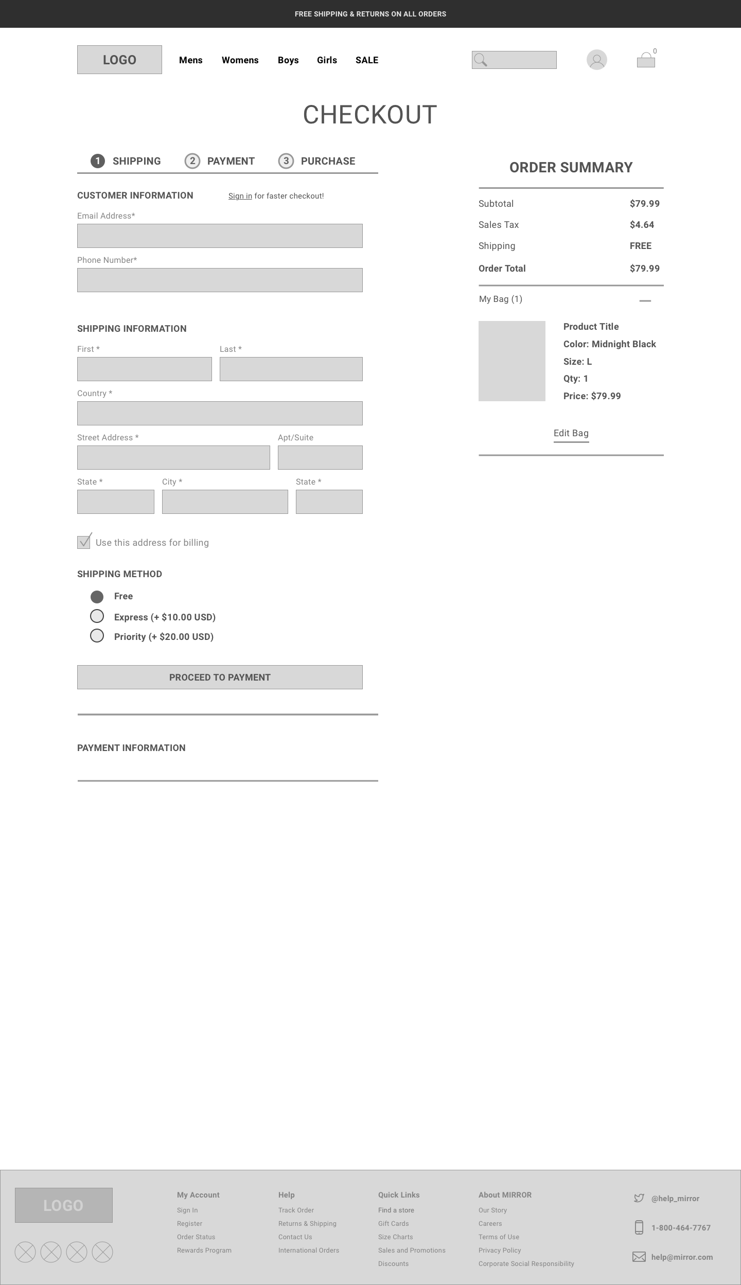
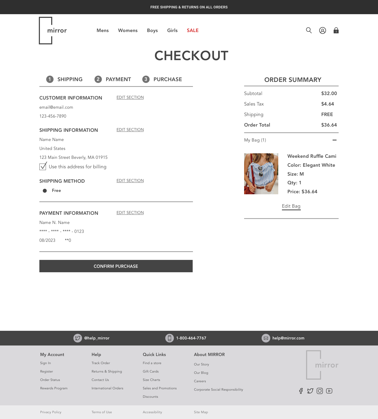
An efficient checkout process helps consumers complete the purchase process.
Users like wish they could shop by season or function. They want to shop for/see whole outfits and not individual pieces.
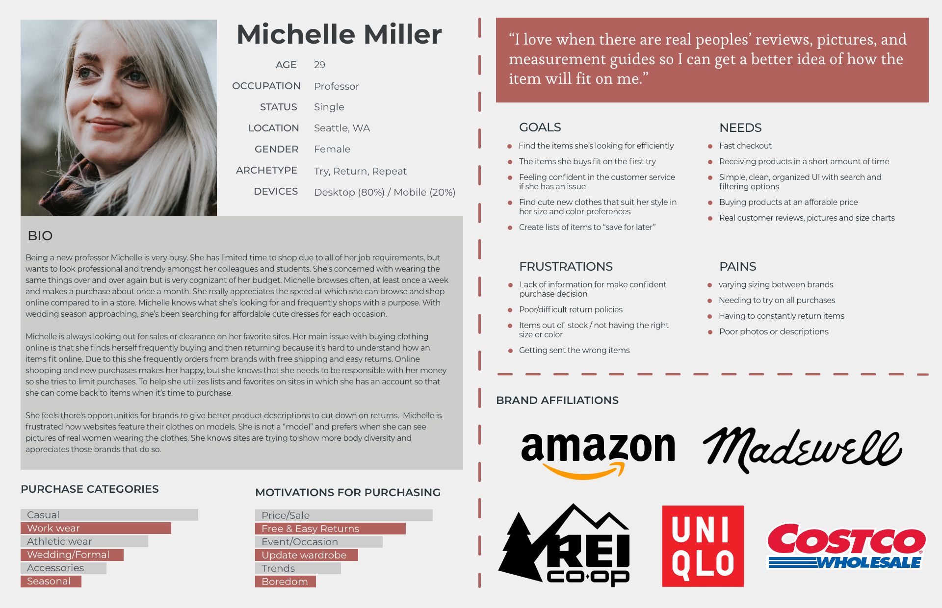
Persona
Empathy Map
Storyboard
Information Architecture
Having gathered data from competitor research and user interviews, the next step was to consider how to organize the site. This was a critical step as an ecommerce site must be easily navigated to help users achieve their goals as well as the goals of the business. While my user interview conclusions directed me to organize the site in a non-conventional form, I wanted to see how other consumers preferred shop by using a card sorting exercise. The goal of this would be to validate or discourage a more non-conventional design.
Card Sorting
Details:
Ages 24 - 65
8 Participants
Mirror provided me with 30 items in their inventory, which I used to execute an online card sorting exercise. The goal of this exercise was to help determine how users expected items to be categorized and uncover any additional insights and confirm assumptions.
Design Patterns vs. Data
After concluding the card sorting exercise, I noticed a trend similar to my user interviews. The participants preferred to organize the items into outfits rather than specific categories such as pants or shirts.
This led to two major design decisions.
Feature looks based on seasons as well as activity
feature a “complete the outfit” section on the product page.
Even though the data showed that users wanted to shop by activity/outfits/season, that couldn’t be the primary organization of Mirrors new site. I still needed to build a site utilizing ecommerce design patterns due to expected user behaviors.

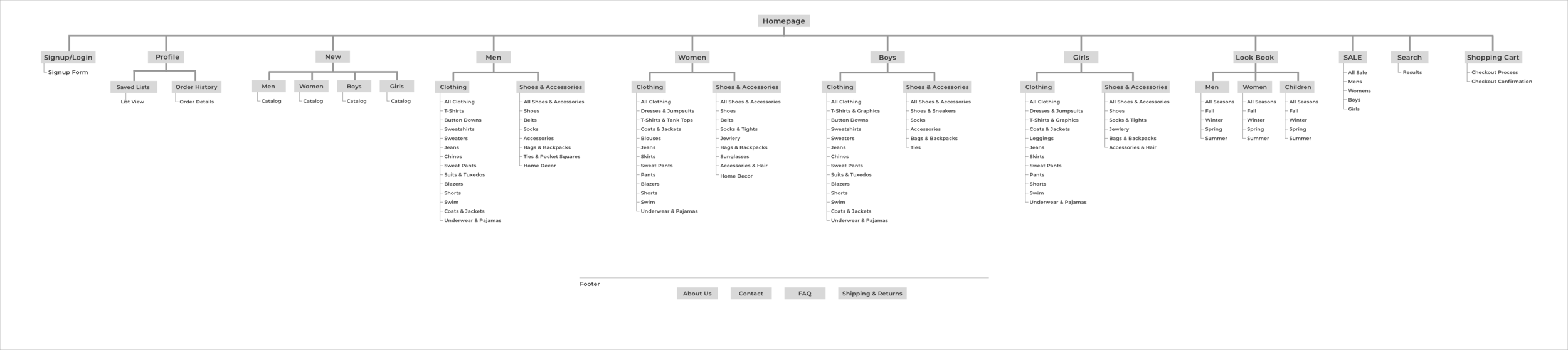
Sitemap
Based on my research, consumers desired a way to shop by activity/season. To differentiate Mirror from the competition and appeal consumers similar to my interviewees I added a Look Book page to the sitemap. This purpose of this page would be to showcase whole outfits based on activities and seasons.
Interaction Design
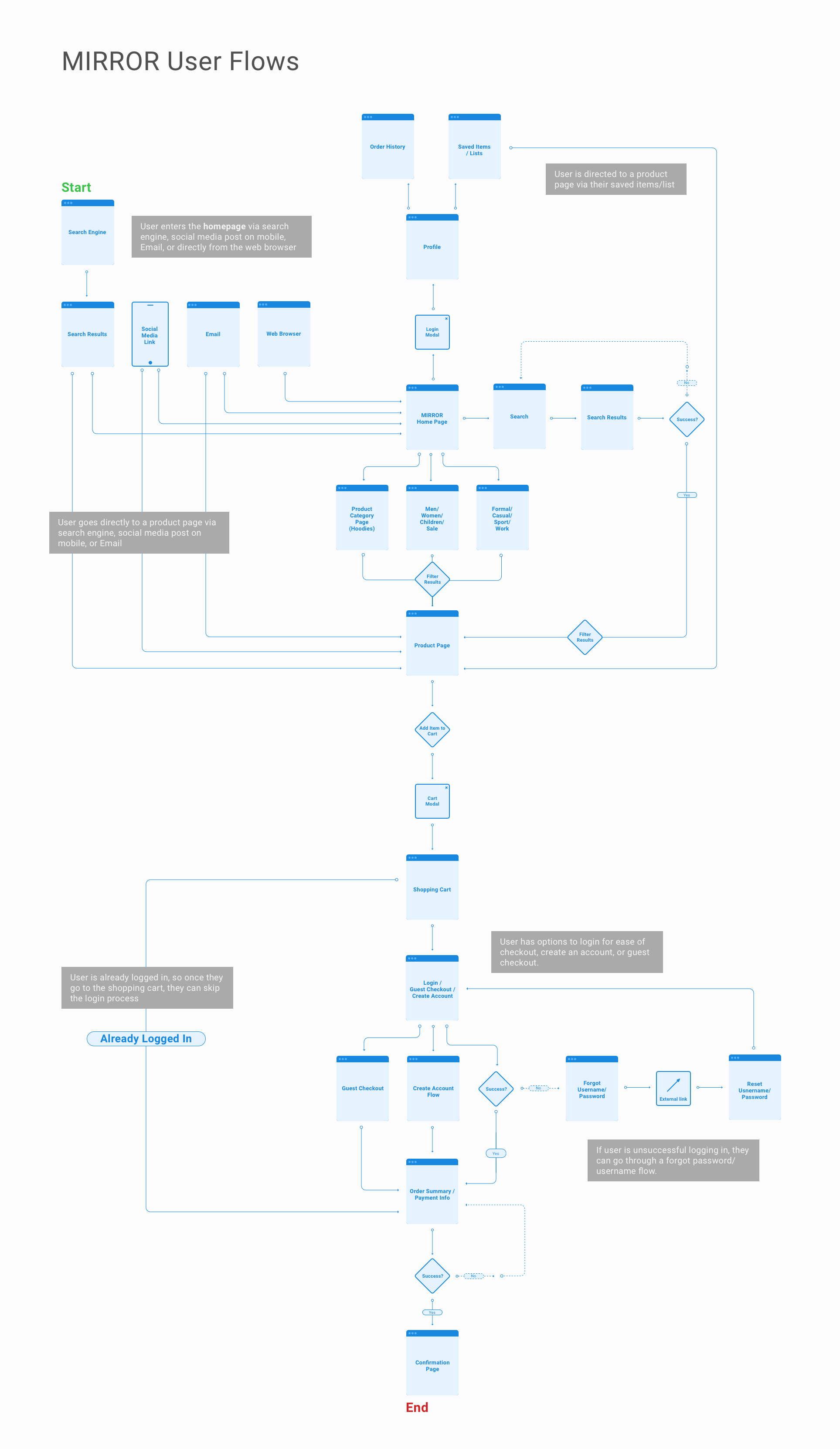
I mapped out a user flow to showcase potential customer interactions with the site to aid in designing the wireframes and prototype.
Key Design Decisions
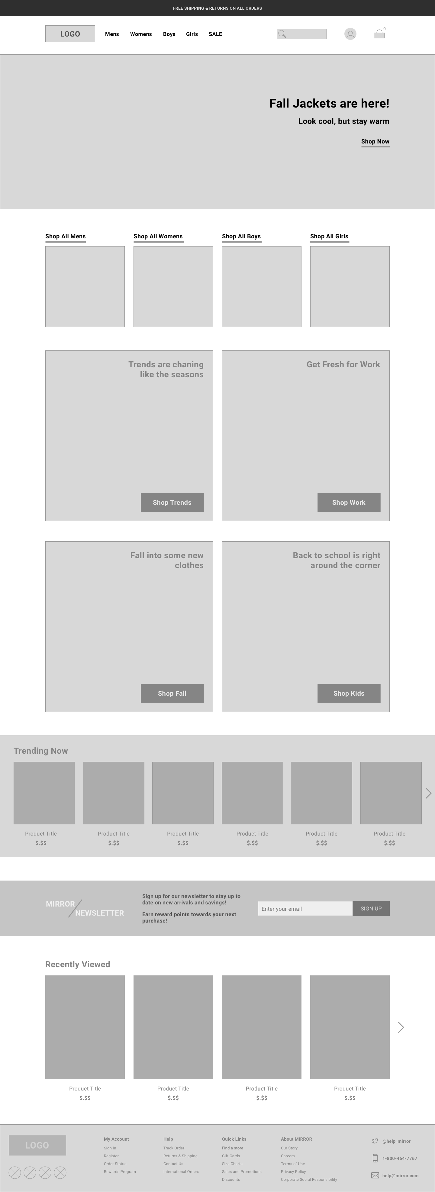
Contrary to some of my research results, I opted to follow existing design patterns to create a more functional ecommerce website, while considering how to mix in elements of shopping by season or activity throughout the site.
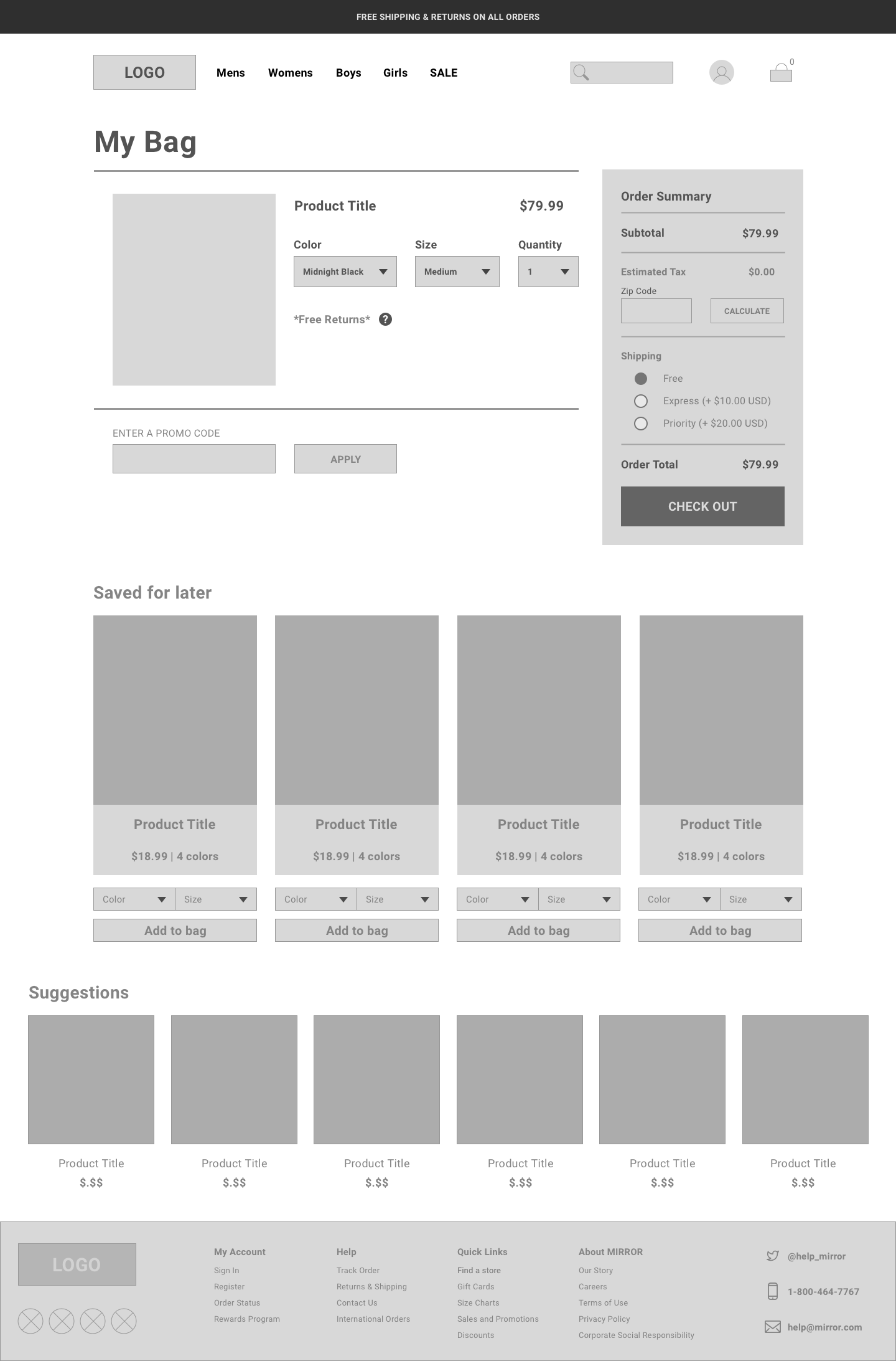
To appease the consumers who prefer to shop by look, I added various elements throughout the website to promote that style of shopping. For example there is a “Shop the Look” section on the product page as well as “suggestions” on the
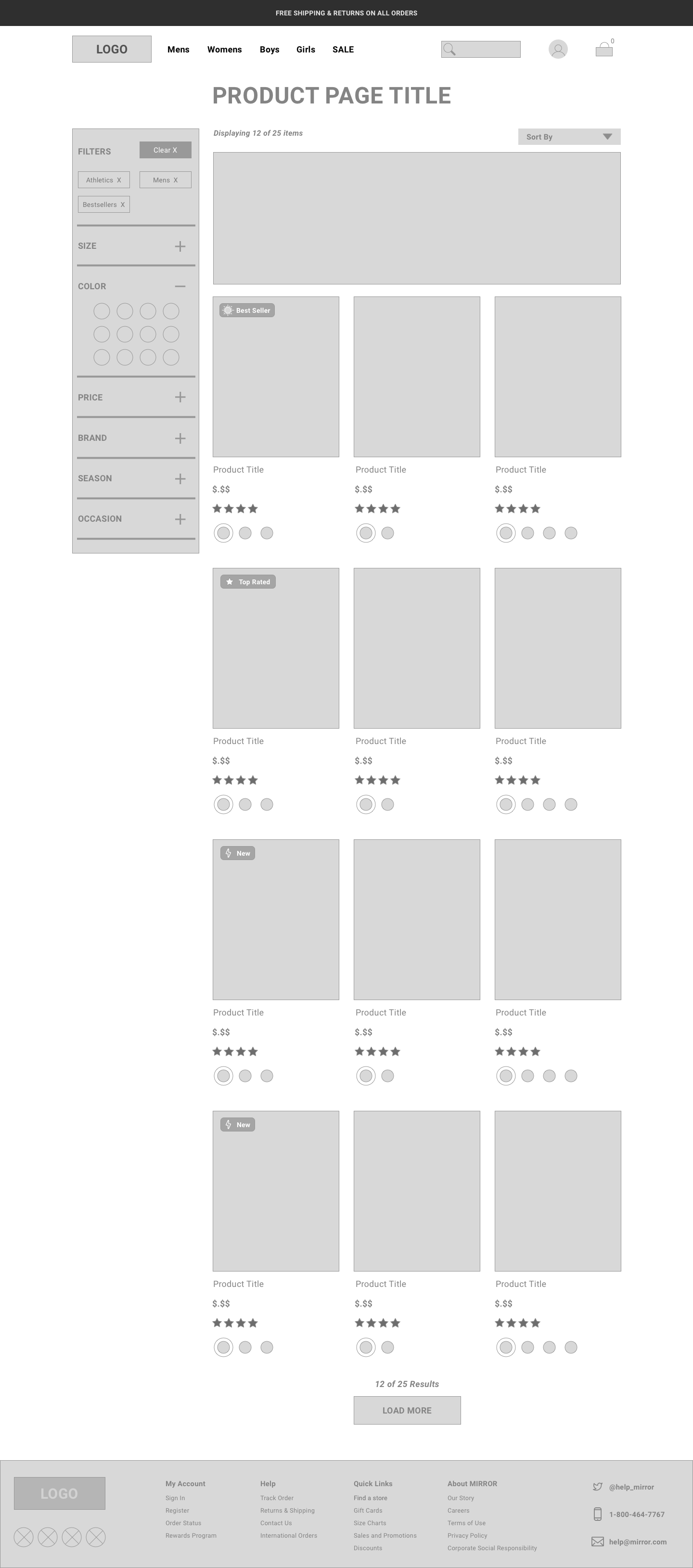
Filtering options were a major necessity for consumers, so I focused on designing a robust filtering experience via an accordion menu.
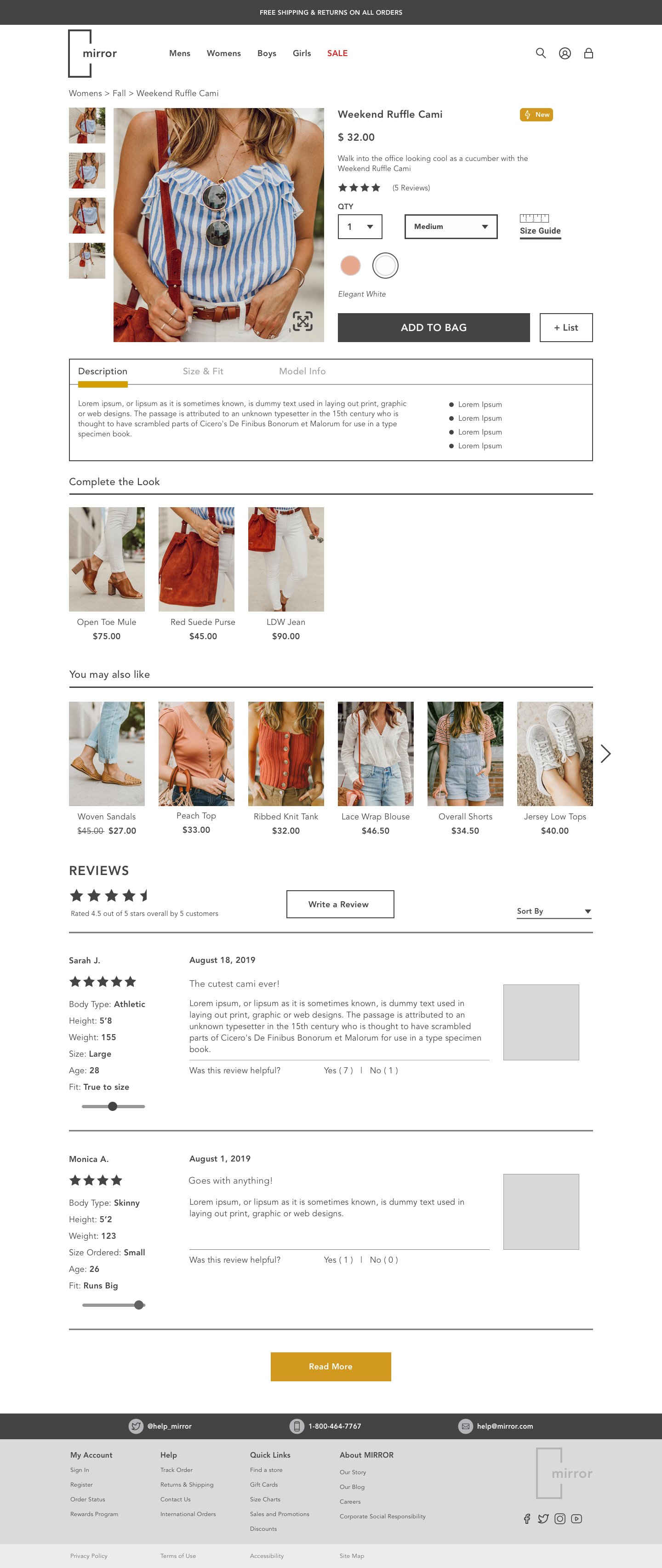
Consumers wanted more details regarding the description of the item, fit of the item and what size the model was wearing along with their dimensions. To accomplish this, I utilized a sliding menu to house all of these details. The sliding menu was chosen to reduce the amount of space the information would take up.
Detailed reviews with sizes and images and additional information about the clothing and model were important elements for buyers to have more confidence when ordering an item, so I designed a robust reviews section with all of the pertinent details.
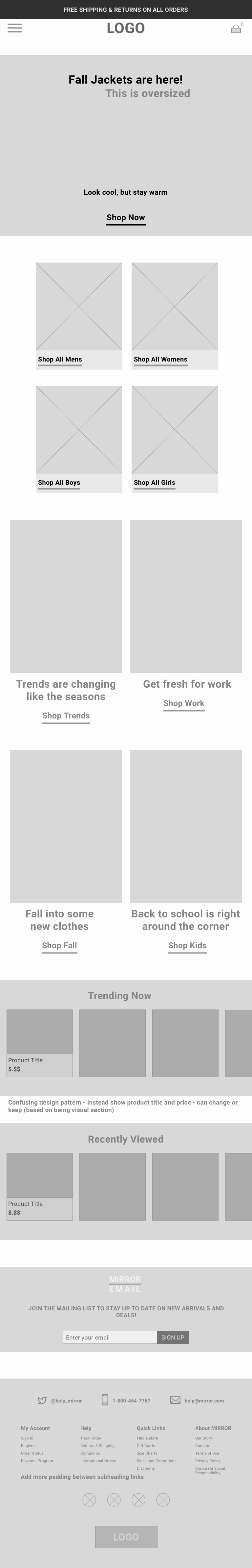
Desktop - Low Fidelity Wireframes


Mobile & Tablet - Low Fidelity Wireframes

Design
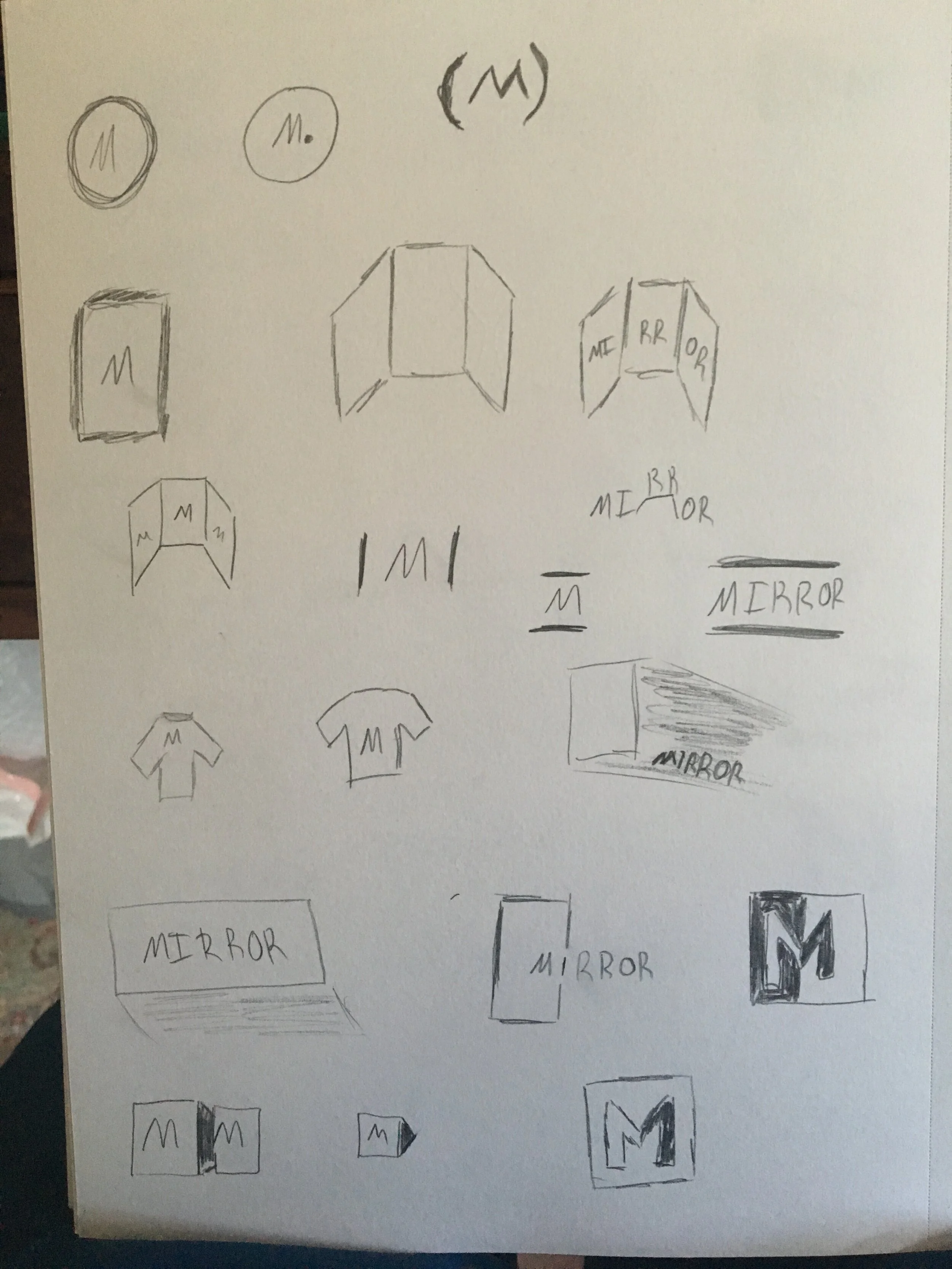
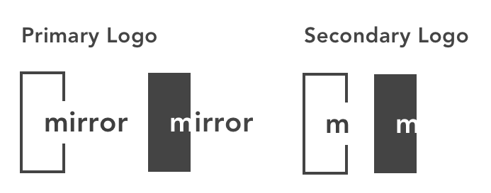
Since Mirror wanted a brand refresh, I started with a mood-board to generate ideas for the vibe of the site and then sketched multiple logo ideas. After the logo was finalized, I utilized the mood-board to construct a style tile complete with color and typography selections.
Logo Design

Visual Design Direction

Color Palette
I chose yellow/gold as the brand color for its welcoming nature as well as wealth
I chose blue as the supporting color for its calming nature and trustworthiness
Font Choice
I selected the Avenir font family for a few different reasons
1. Readability
2. Various weights to assist with visual hierarchy
3. Fresh and modern design

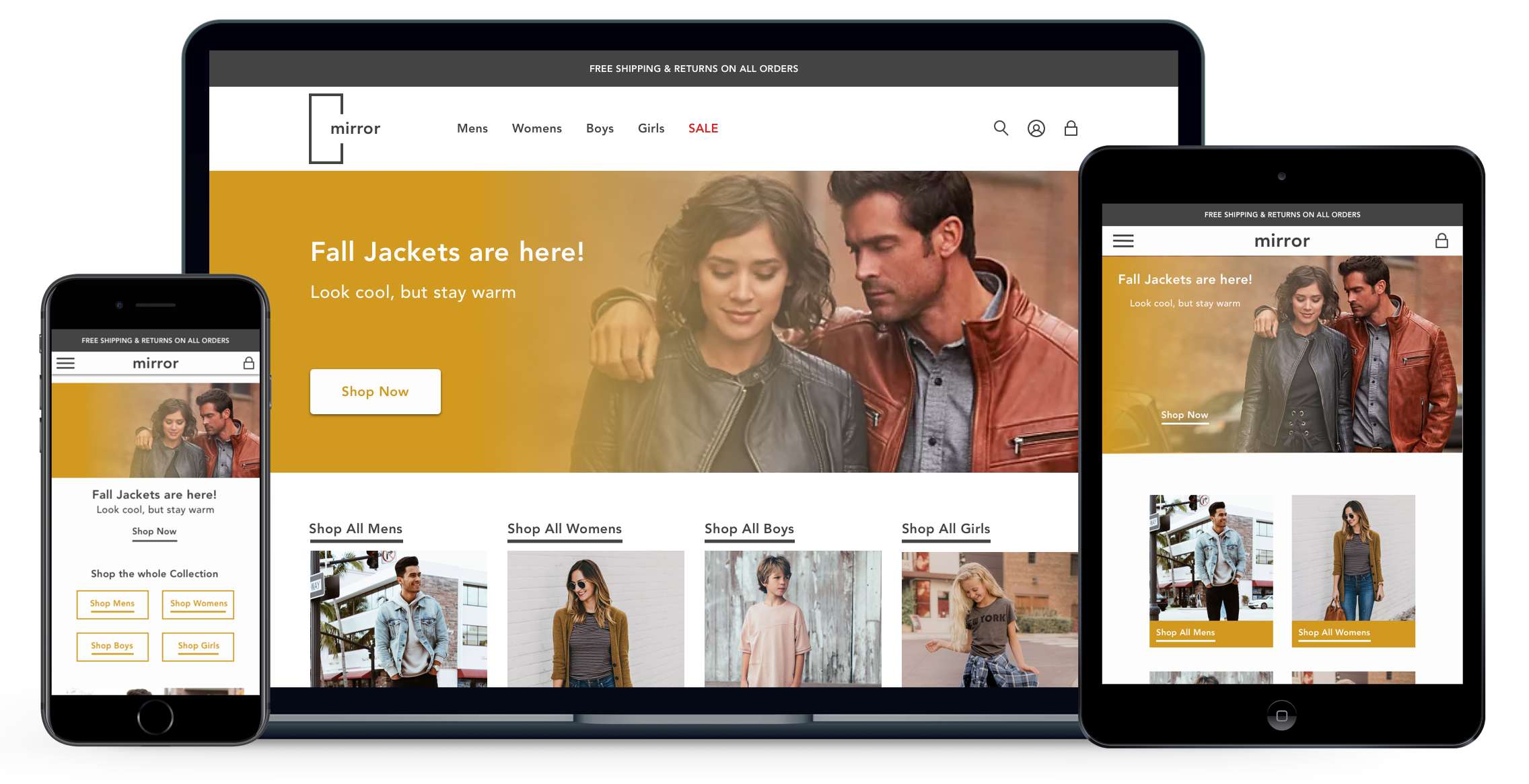
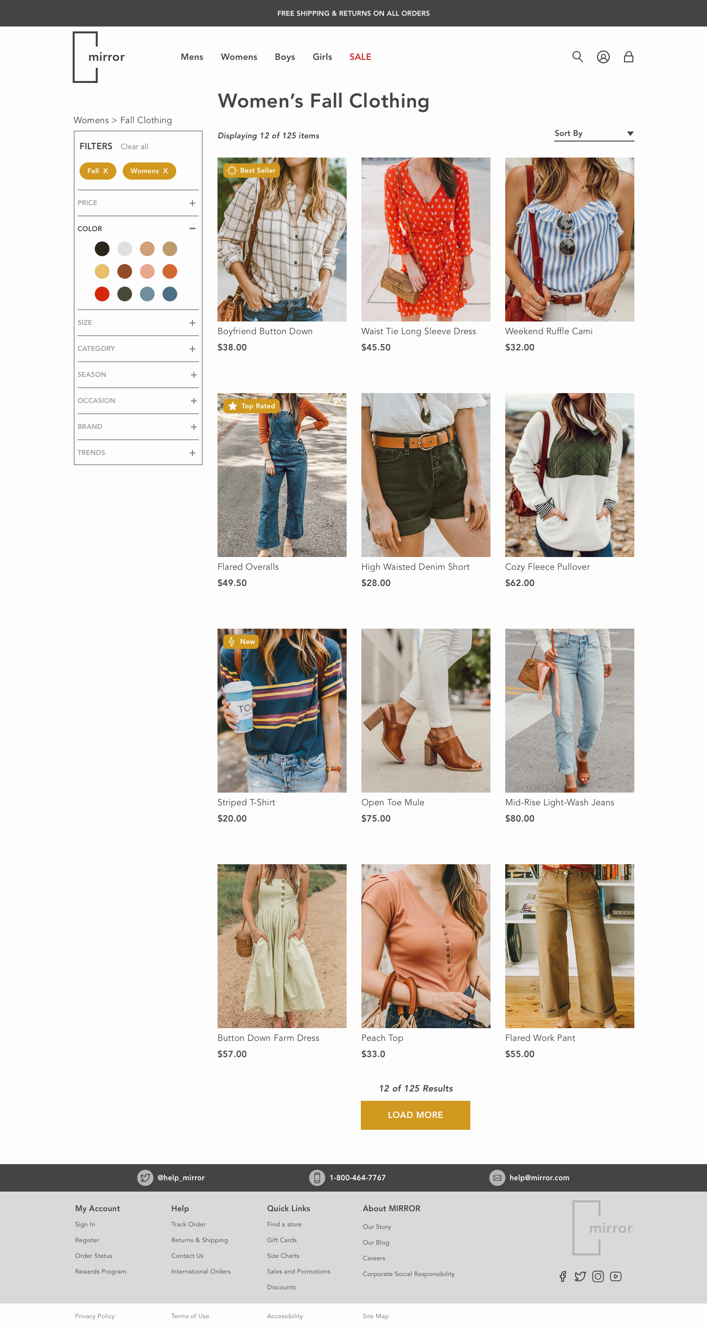
High Fidelity Wireframes


Test & Iterate
Usability Tests
Details
5 Usability Tests
3 males / 2 females
Ages: 28 - 65
Task Completion Rate: 100%
Error Rate: 0%
Conclusions
The initial prototype featured limited functionality which lead to confusion for testers.
Testers thought the UI was aesthetically pleasing and functioned as they would’ve expected.
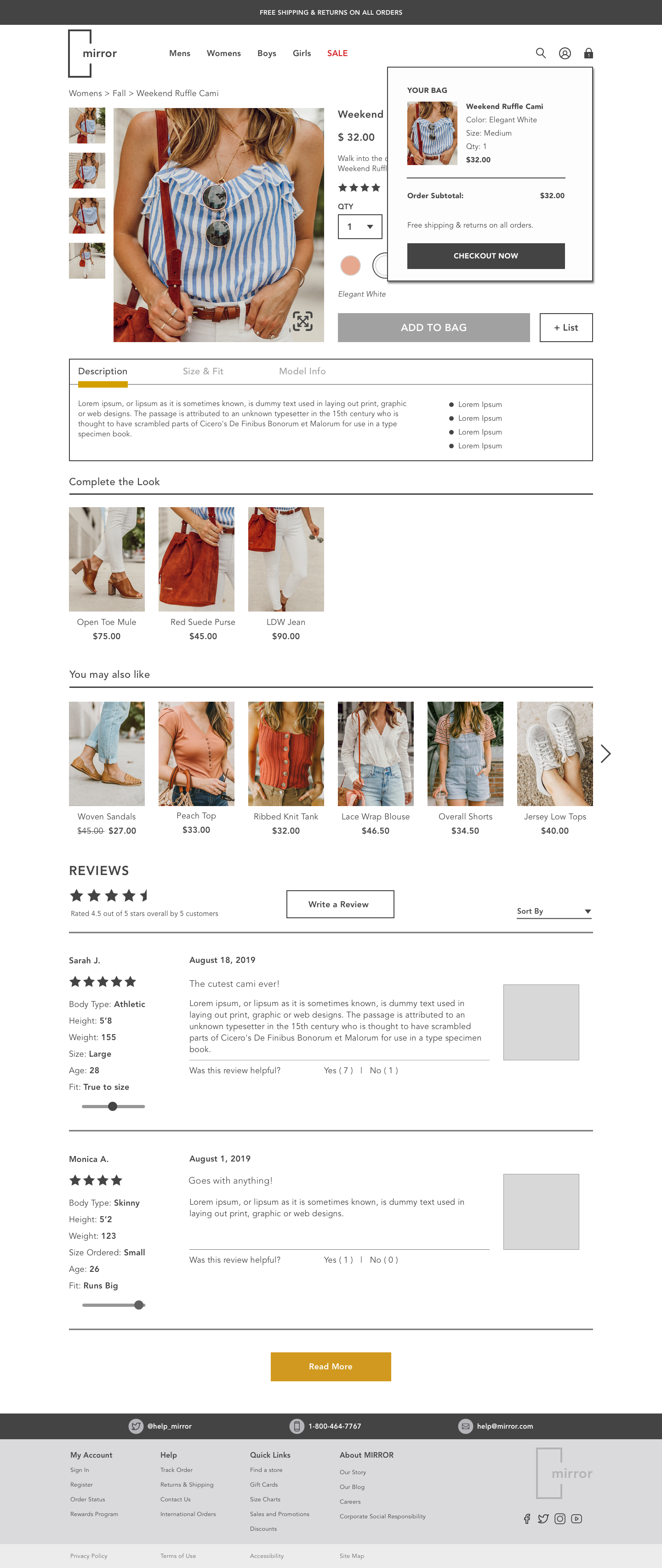
The popup modal when adding and item to their cart would’ve positively influenced their purchase decision.
While the site design was pleasing for the testers, they thought that the site as a whole could be scaled down. Everything felt a bit big.
Iterations
Changes
Scale down the size of elements so that users understand there’s more information below the fold
Redesign the filters element on the product catalog
Reduce business to keep the users eye on the primary task
Move the confirm purchase button higher up on the purchase page to influence conversions
Remove heart button to remove confusion between that and + list button
Future Improvements
Improve visual design
Formalize typography throughout the site
Add Look Book page to site where users can shop based on category such as wedding or work
Key Learnings + Next Steps
Key Learnings
Listen to the User Research & Validate Assumptions. Assumptions can jumpstart a project on a tight timeline, but you must validate those assumptions. One of my assumptions, which turned out to be incorrect was that consumers would want a personalized shopping experience. After conducting user interviews I found out that many shoppers would prefer to find items on their own.
Don’t reinvent the wheel when working within a mature industry. Although a limited sample size, three of the five interviewees mentioned how they wished they could shop based on categories / activities. While trying to listen and adapt to the customers desires, my initial designs focused on this concept. What I learned was that while the users I interviewed preferred a more unique shopping experience, the majority of users still expected a traditional ecommerce experience. Regardless of the pretty nature of my interface, it lacked functionality. As a designer, we have to remember we’re designing for the users and not ourselves. No matter how cool a product looks, if it’s not usable the product and business will fail.
Users will take many different paths to find the items that they are looking for. While building the initial prototype I planned for users to take one path to complete the required task. This led to testing errors because users wanted to utilize the search field and navigation in ways that I had no planned. Therefore, while doing user testing, I should’ve built out a more robust prototype to account for various user actions.
Next Steps
Test → Conduct more usability tests based on the changes made during the first phase of iteration focusing on the size and spacing of elements on the site.
Iterate → Make any necessary design changes based on the feedback from testing.
Repeat (if necessary) → Repeat testing and iteration until the product/new feature is at a point where it’s ready to be shipped.
Refine → Put the finishing touches on for launch.
Get in touch!
If you would like to get in touch with me about this project, working together, or just want to say hi, hit the button below!