
Honored Barbershop
Designing a responsive website for a local business.
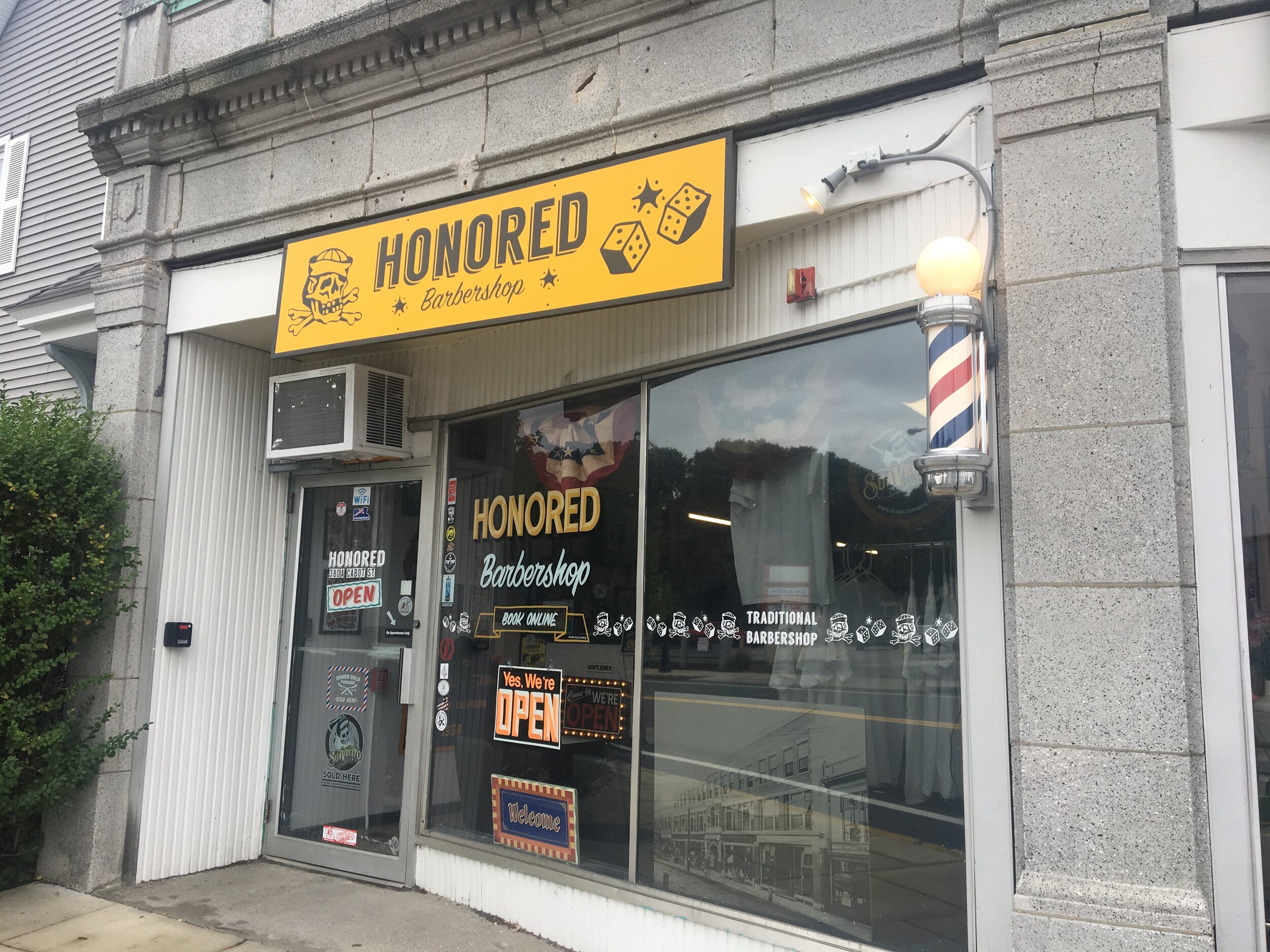
Honored is a local barbershop located in my hometown of Beverly, Massachusetts. I redesigned a responsive website with a focus on usability and accessibility.
Brief
Design a responsive website for a local business. Evaluate the current state of their web presence and make improvements based on conclusions from various research methods while working within the established brand identity.
Background
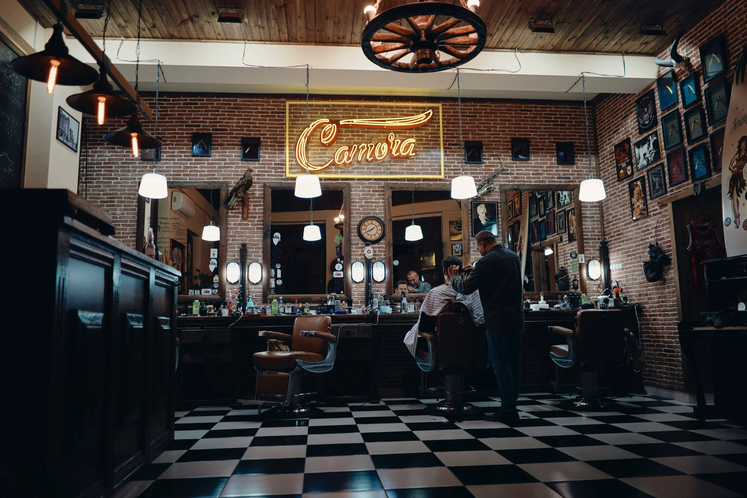
After moving from Seattle, WA to Beverly, MA I had to look for a barber that would replicate the kind of haircut and overall experience that I came to appreciate in Seattle. It took over three years to find the perfect barber and now I needed to repeat that search locally.
I began my search for a new barber on Google to get an idea of my local options; next I checked the reviews of the local shops on Yelp and once I narrowed down the potential shops, I visited their websites to make a final decision and book an appointment. I chose Honored based on the positive reviews but also because they had the best site compared to the competition.
Throughout my research for a new barber I noticed that many of the local barbershop websites could use a little help on both the UX and UI of their websites.
Solution
Improve the readability, user experience and overall design.
Goal
Design a more user friendly responsive website for Honored Barbershop
Roles
UX Designer: low fidelity sketching, low fidelity wireframes, high fidelity wireframes and prototypes
UX Researcher: secondary research, competitive analysis, user interviews, survey and usability tests
UI/Visual Designer: color palette, branding, style guide, and overall visual appearance
Duration
80 hours (2-weeks)
Tools Used
Pencil and paper, Sketch, Google Forms, InVision, Gloomaps, Flowmapp
Research
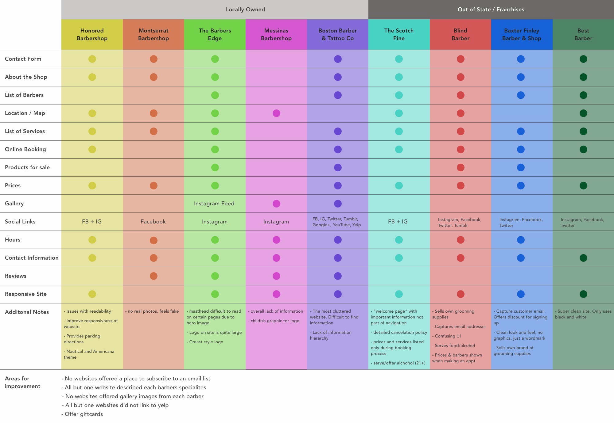
I reviewed at the landscape of local barbershops as well as out-of-state barbershops to understand what barbershop sites looked like across the US. I looked for what information was provided to the consumer, how the site was structured, and how the shop aesthetic shown through on their website.
Secondary Research

Old-school barbershop
New-school barbershop
The male grooming industry is in an economic boom; so much so that it’s set to triple in size by 2020.
Barbershops are changing. The old school barbershops our dads went to are closing down and giving rise to a new generation of shops. With so many new barbershops opening their doors, they are aiming to create unique experiences for their consumers to build a brand identity and customer loyalty.
New barbershops are no longer just delivering a service, but rather a lifestyle; each one tries to offer a different aesthetic to appeal to their clientele.
Competitive Analysis
Conclusions
Geographic location plays a major role in the aesthetic of the barbershop brand and website. The more densely populated the surrounding area is, the more robust their website will be.
The only consistent information across all shops I researched was their contact information including, phone, email and address.
Various websites offered a variety of information including services/prices, about sections, reviews, galleries, and social links.
Most websites had a lack of information hierarchy and didn’t follow established design patterns.
There were many areas of improvement for the barbershops. Just offering customers more information in an organized manner would be a huge upgrade to many sites.
User Interviews
Details
6 Interviews
Men | Ages 27-30 years old
Goals + Desires
Have confidence they are going to get a quality haircut at an affordable price
Ease of booking an appointment, whether calling ahead, booking online, or just walking in
Dependable barbershop within close proximity to interviewees home or office
Establish a relationship where you are both familiar with each other and the style of haircut you (the client) would like
Pains + Frustrations
Getting a haircut that you don’t like
Overpaying for a haircut
Having to wait an extended period of at the barbershop before getting your haircut
Difficulty communicating your desires to a barber
Lack of pertinent information on websites
Poor websites/user experience
Interview Conclusions
Barbershop websites are not consumers first stop when making a decision of where to go. Instead, consumers use Google to search for local shops. They then turn to Yelp to read reviews and help pair down the list of possible locations down. Finally, they go to the barbershop website to validate the reviews and get more information such as contact info, hours, and services/prices.
Easy access to information is extremely important to customers. They don’t want to have to search to find basic information such as address, hours, contact information, forms of payment accepted, and how to make an appointment.
Ranked from most important to least important:
1. Quality of haircut
2. Price
3. Proximity
4. Availability
5. Vibe of the stop

Survey
To further validate the conclusions from my user interviews, I turned to a survey to get a larger set of data. The responses from the survey helped me with design decisions such as what information to include and how to structure the website.
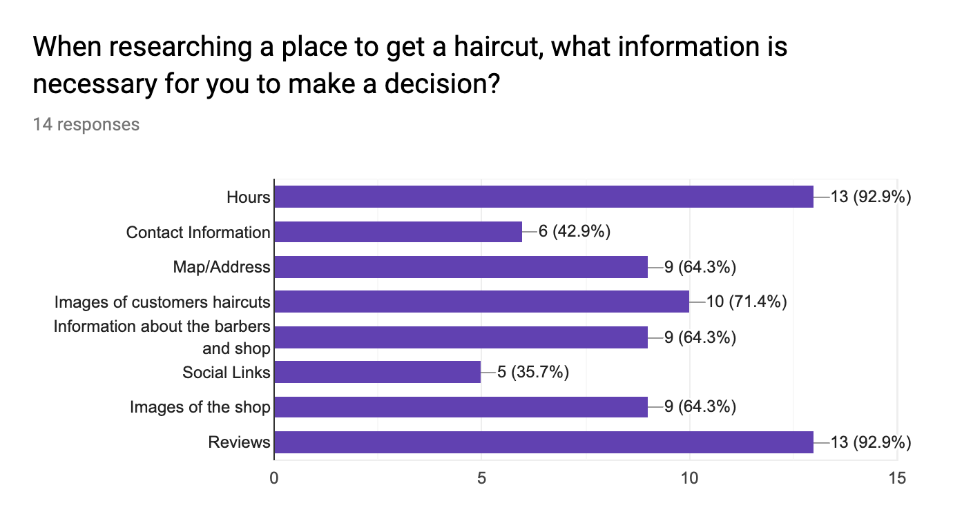

Yelp is the main resource for finding a new shop/salon to get a haircut, Google is a close second
Respondents said they would visit the shop’s website prior to making an appointment
100% of respondents said that the appearance of the website would impact their decision to make an appointment
Hours, reviews, and price were the most necessary information customers needed to make their decision
Quality of the haircut was the most important decision factor, followed by vibe of the shop, proximity and then price
Design Opportunities
Providing more information in an organized manner. There was a lack of continuity amongst competitors in terms of their visual hierarchy, site structure, and the information they provide to visitors.
Most important information upfront. Based on research conclusions, potential customers grew frustrated when they couldn’t find the information they were searching for immediately. To them, this information should have been front and center. Secondary information such as “about the shop/barbers” or reviews were appreciated but should be below the fold.
Seamless booking experience. Clients preferred a native booking experience versus being bounced to a new page/site. To reduce the act of bouncing users from page to page during the booking process, I designed a single page booking process.
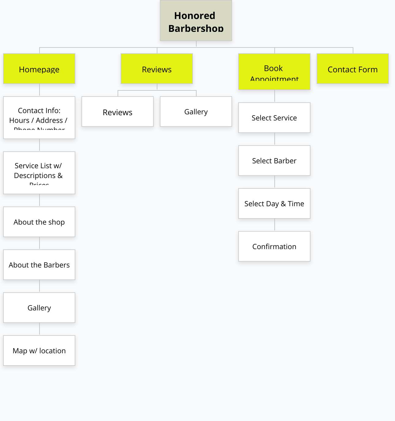
Information Architecture
Since simplicity and easy access to information was most important to the users, I designed a sitemap that focused on delivering pertinent information quickly to users based on the page they were viewing. While this sitemap doesn’t represent the final deliverable, it was intended to help guide the design of my wireframes.
Sitemap
Low Fidelity Sketches
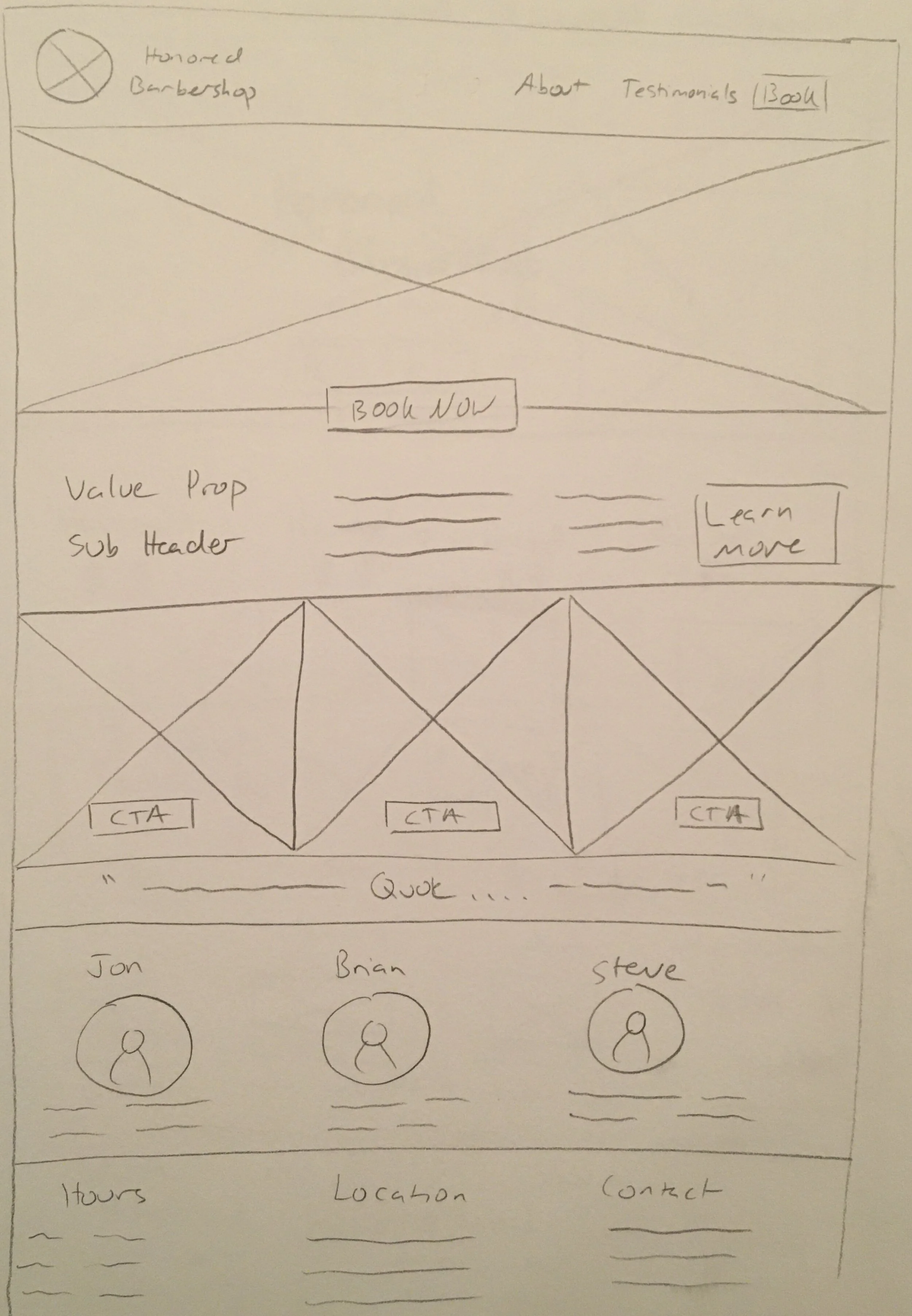
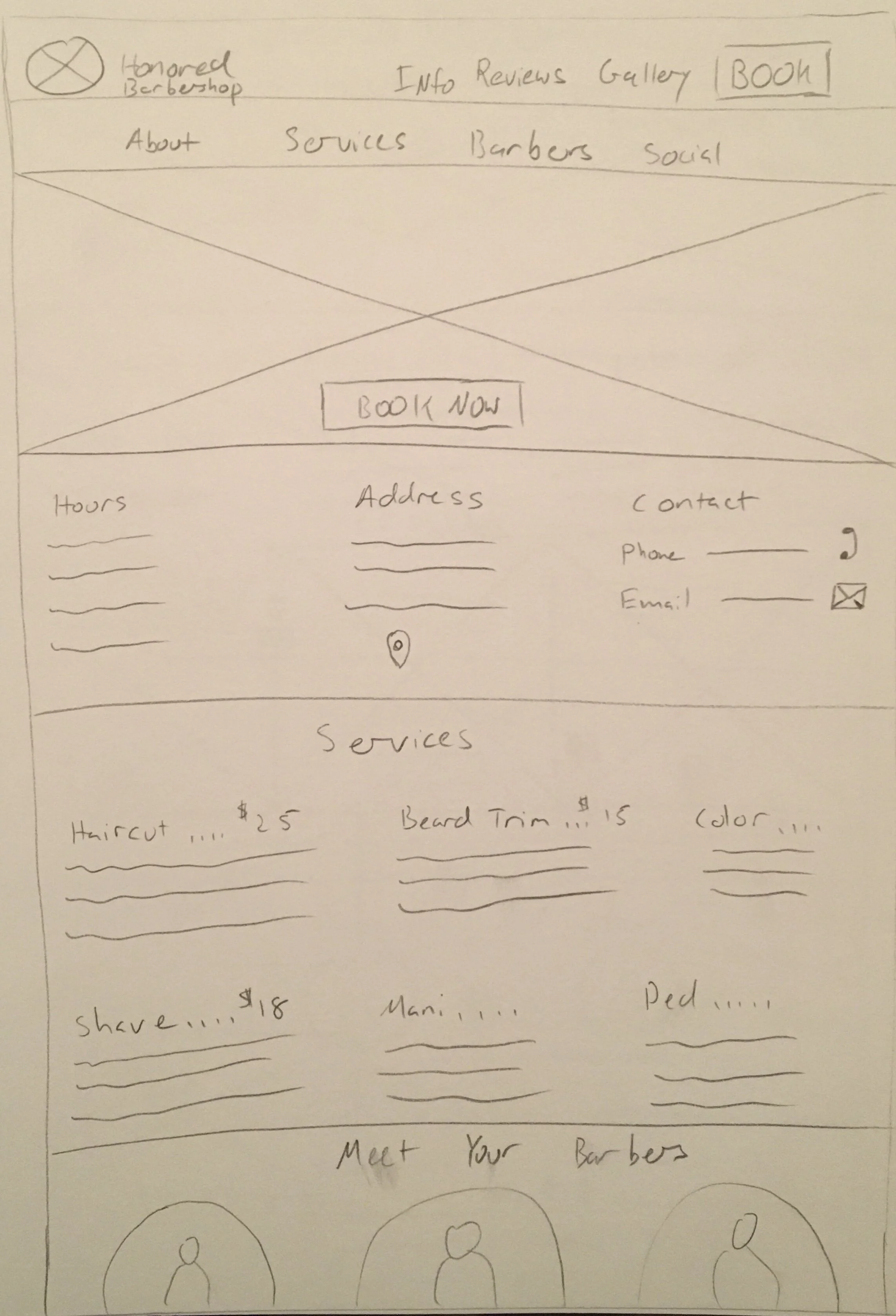
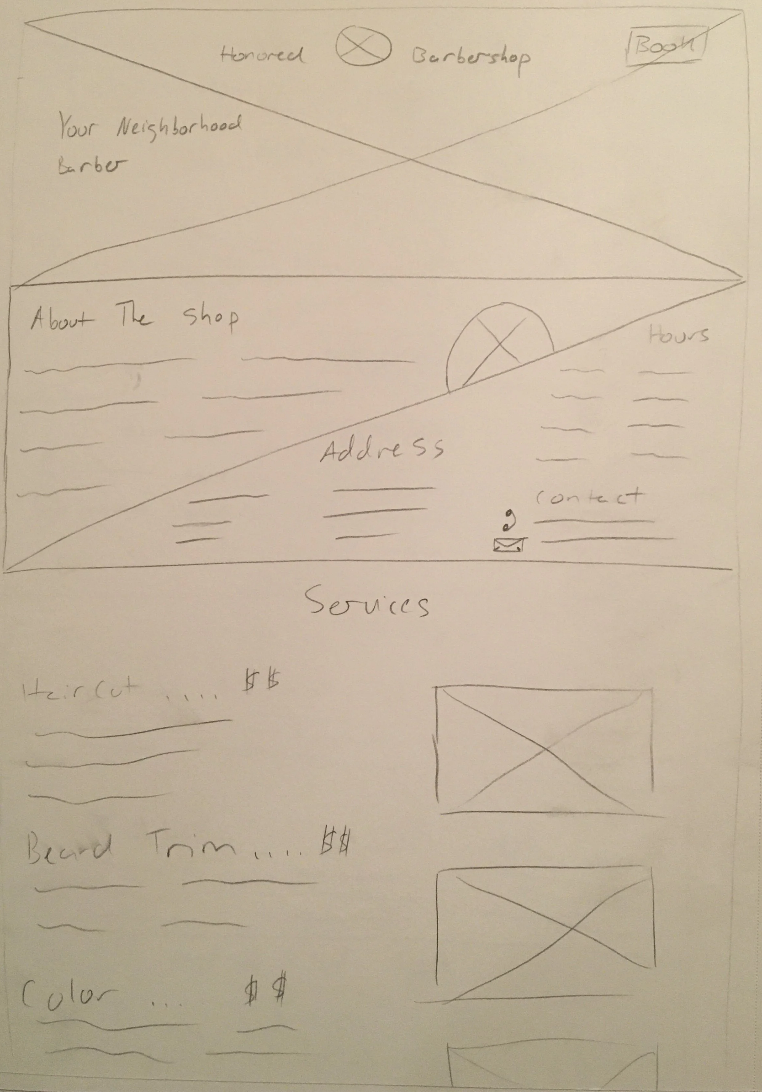
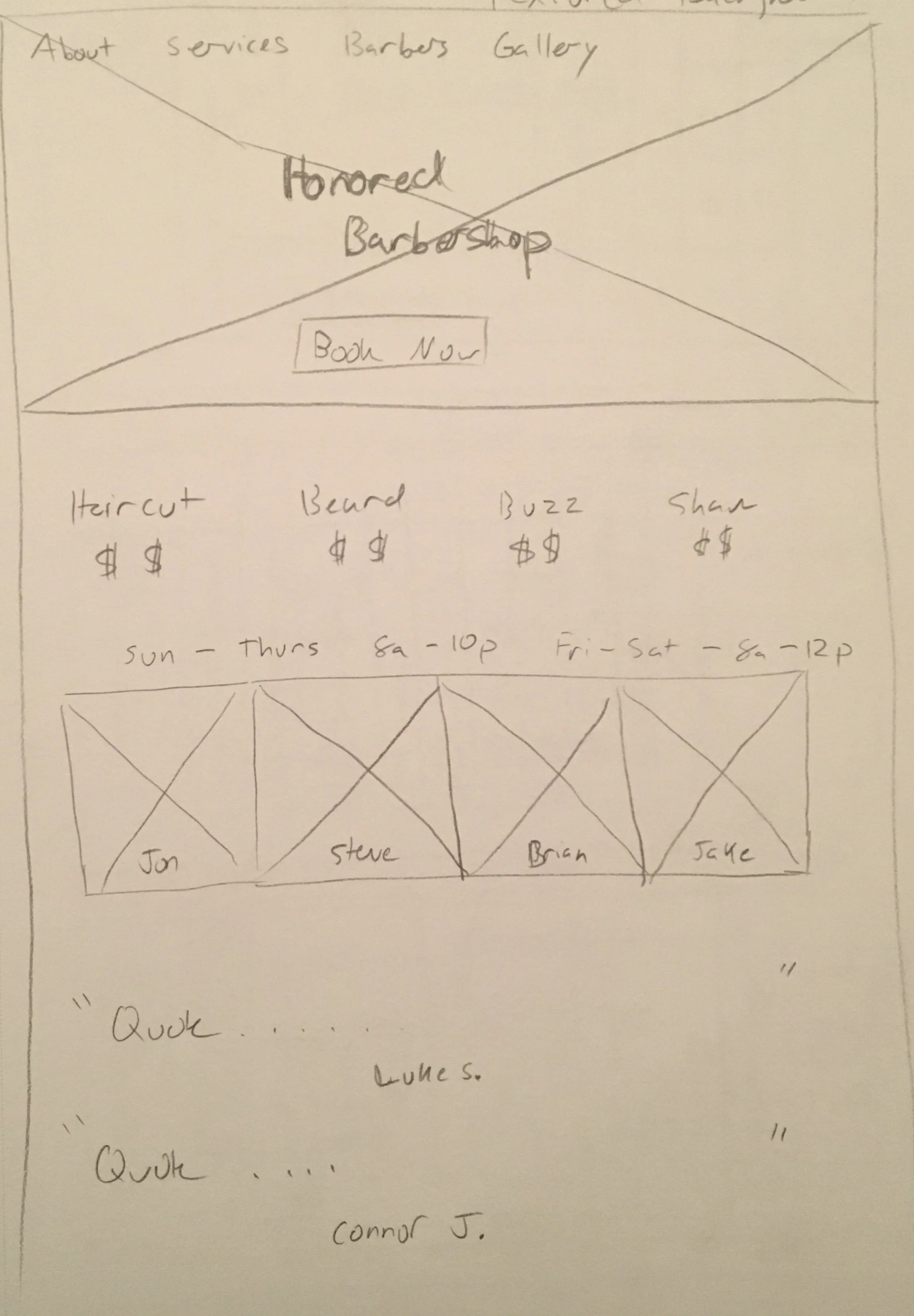
During sketching I workshopped two primary ideas: a single page scrolling site and a multi-page site. I liked both concepts enough to design low-fidelity mocks to see which concept would work better for users.
For the five different single page sketches I tested out different concepts of displaying pertinent information.
The concept for the first sketch was promoting the unique value proposition of the shop to call attention to a certain clientele.
The second, third, and fourth sketches focuses on delivering the desired information upfront, specifically the hours, location and contact info, along with the services/prices.
The fifth single page sketch combines all of the elements from the other sketches with a section on communicating with your barber, which was a pain point for consumers.
The final sketch is of the multi-page concept, where each rectangle is a separate page for the home page, about page and services page.
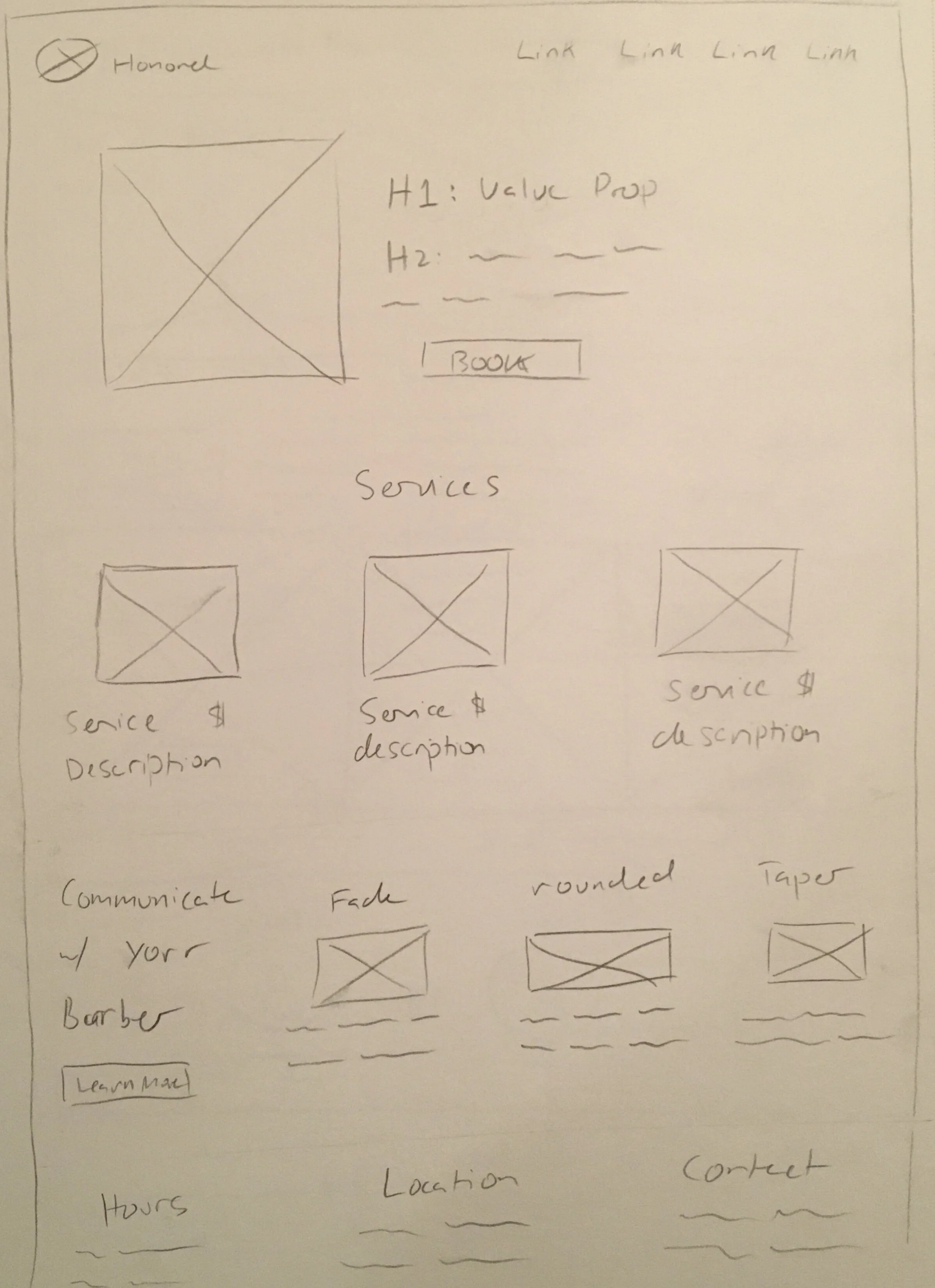
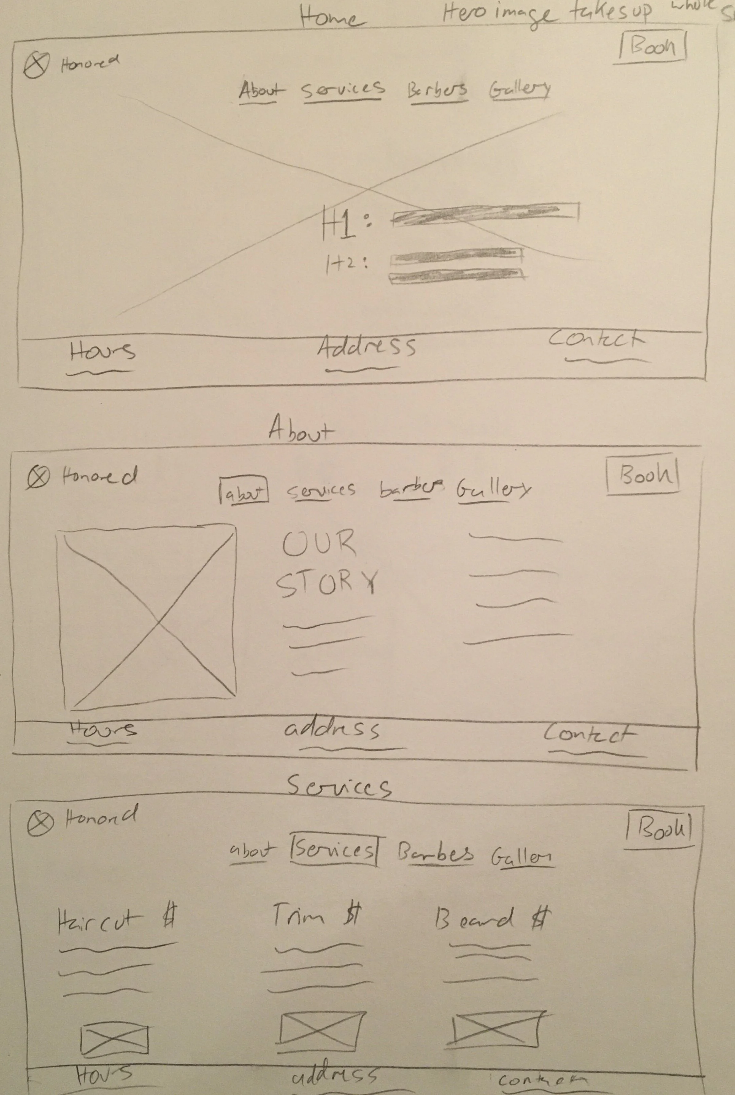
Low Fidelity Wireframes
Since a major pain point for consumers was finding basic information such as address, contact info, services/prices and walk-ins vs. online booking, I experimented with two design concepts to figure out which one would work best to deliver that information efficiently.
Mobile - Multi-page Website


Desktop - Multi-page Website


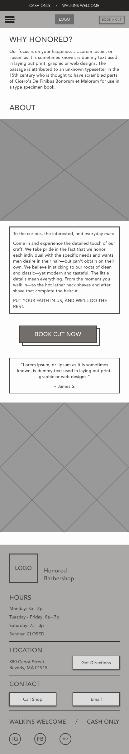
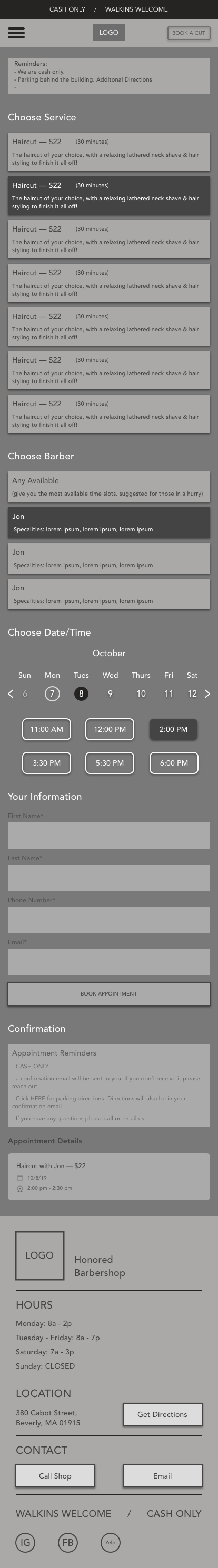
Mobile - Single Page Website


Desktop - Single Page Website

Design Decisions/Assumptions
Due to limited time constraints, I made the choice to move forward with the single page design. I would’ve liked to field test these two designs and move forward with the preferred option had I had more time. I chose this design because I believe it is easier for users to access information compared to the multi-page site. Ease of access to information was a major conclusion from my research which prompted this decision and a few of my interviewees mentioned they preferred single page websites.
Design
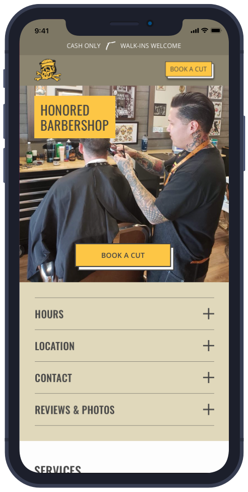
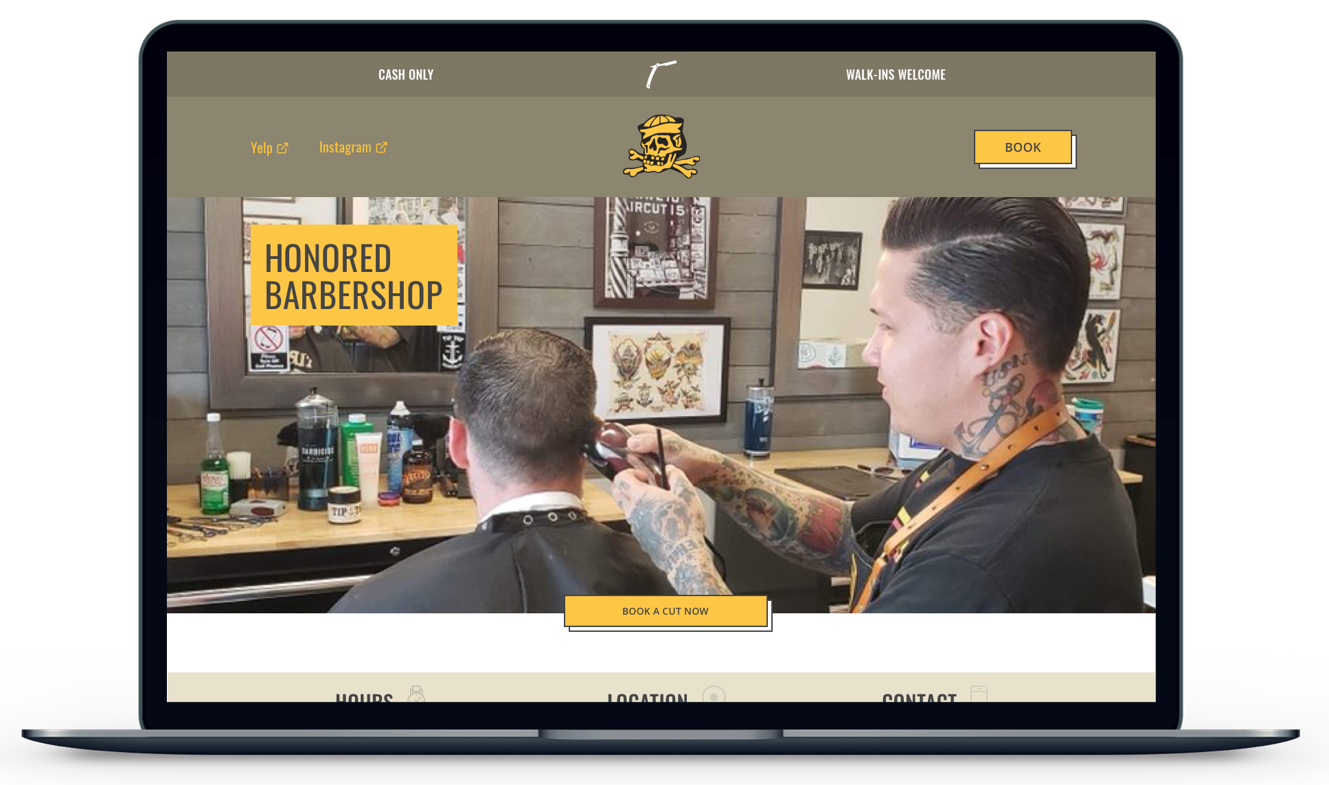
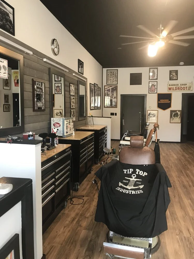
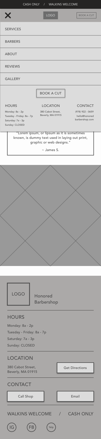
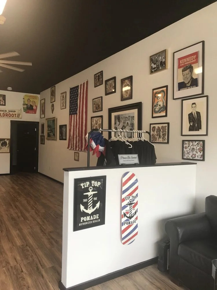
After deciding to move forward with the single page design, I focused on creating a color palette that would retain the major brand color and vibe of the shop. Jon (Honored Barbershop owner) is a veteran of the United States Navy and has travelled all around the world. His life experiences have influenced the vibe throughout his shop which features vintage art, skateboard culture, Americana and traditional American tattoos. The shop feels pretty “manly” so I wanted to bring out those qualities in the color palette and site design.
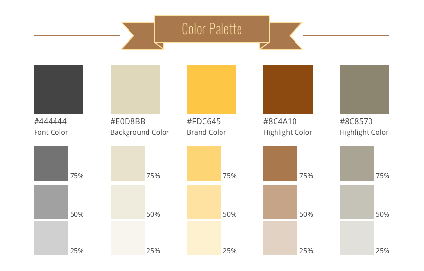
Color Decisions
I decreased the saturation of the brand color and used a slightly lighter mustard/gold color to reduce visual contrast and increase the approachability.
I chose a lighter yellow because its typically associated with warmth and hospitality which is what is at Honored’s core. “They’d be honored to cut your hair.”
I used brown and green as highlight colors because they were analogous colors with yellow. The darker values added to the masculinity of the site.
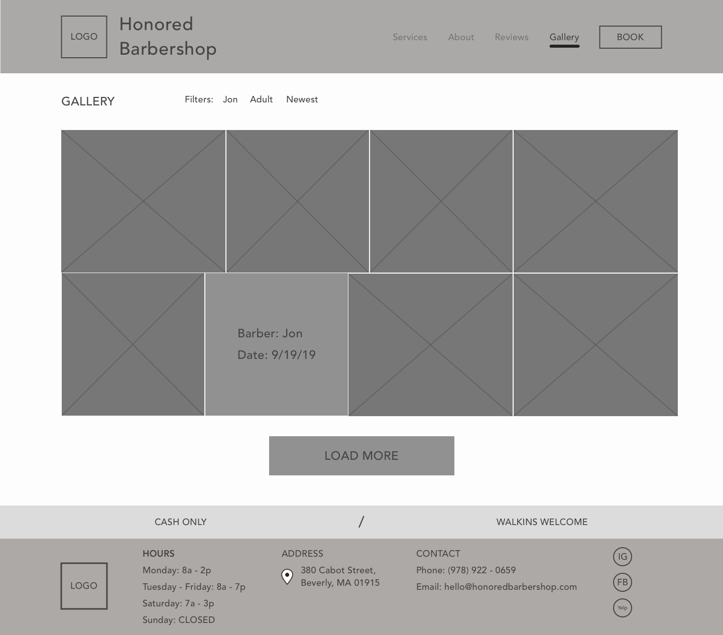
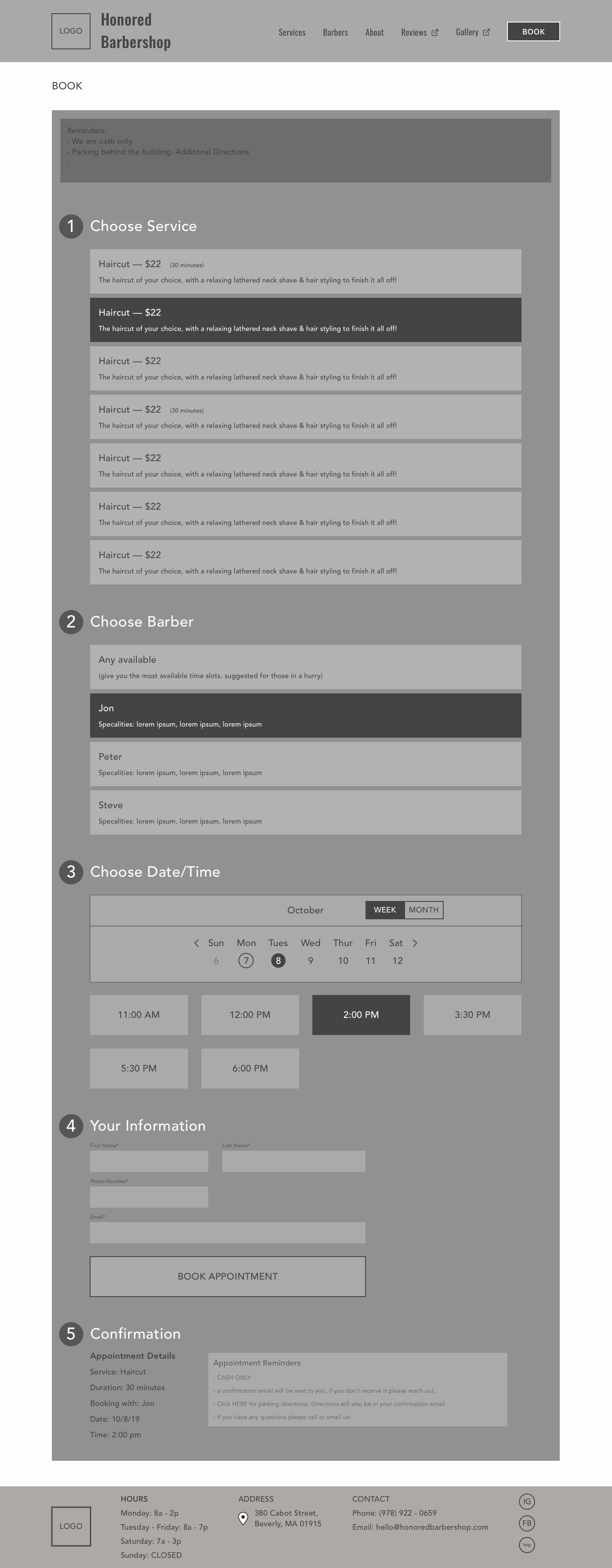
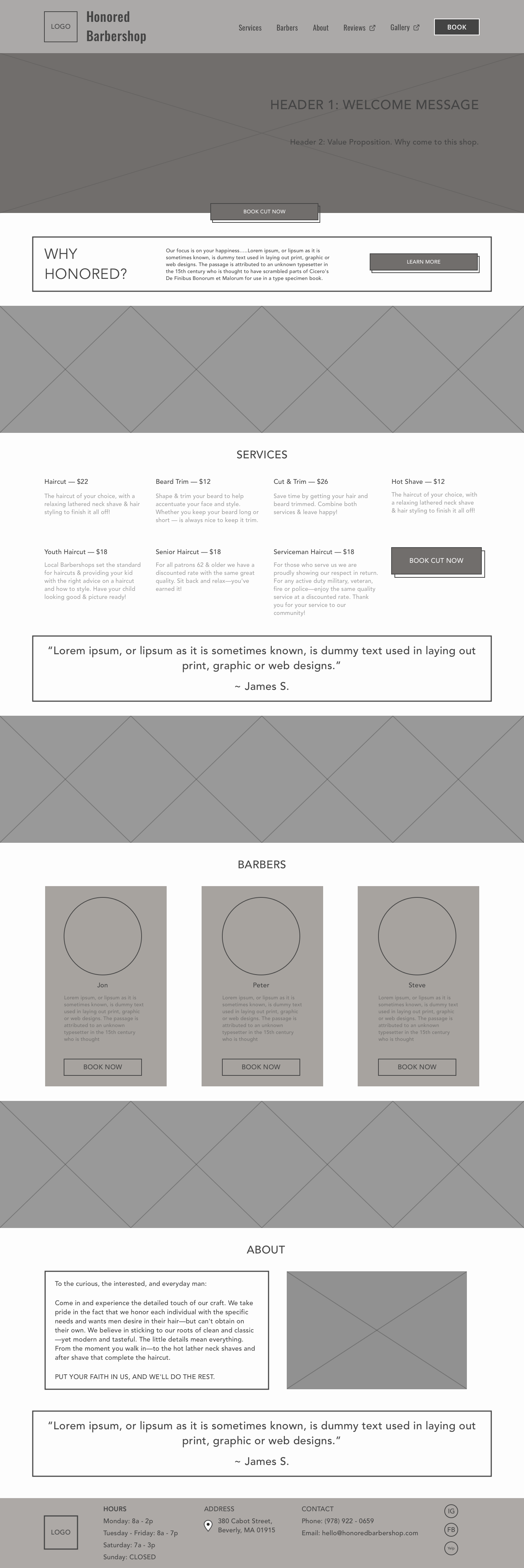
Desktop High Fidelity Wireframes


Mobile High Fidelity Wireframes


Test & Iterate
Usability Tests
Details
6 usability tests
4 males / 2 females
Ages: 26, 28, 28, 29, 53, 65
Task Completion Rate: 95%
Error Rate: 10%
Conclusions
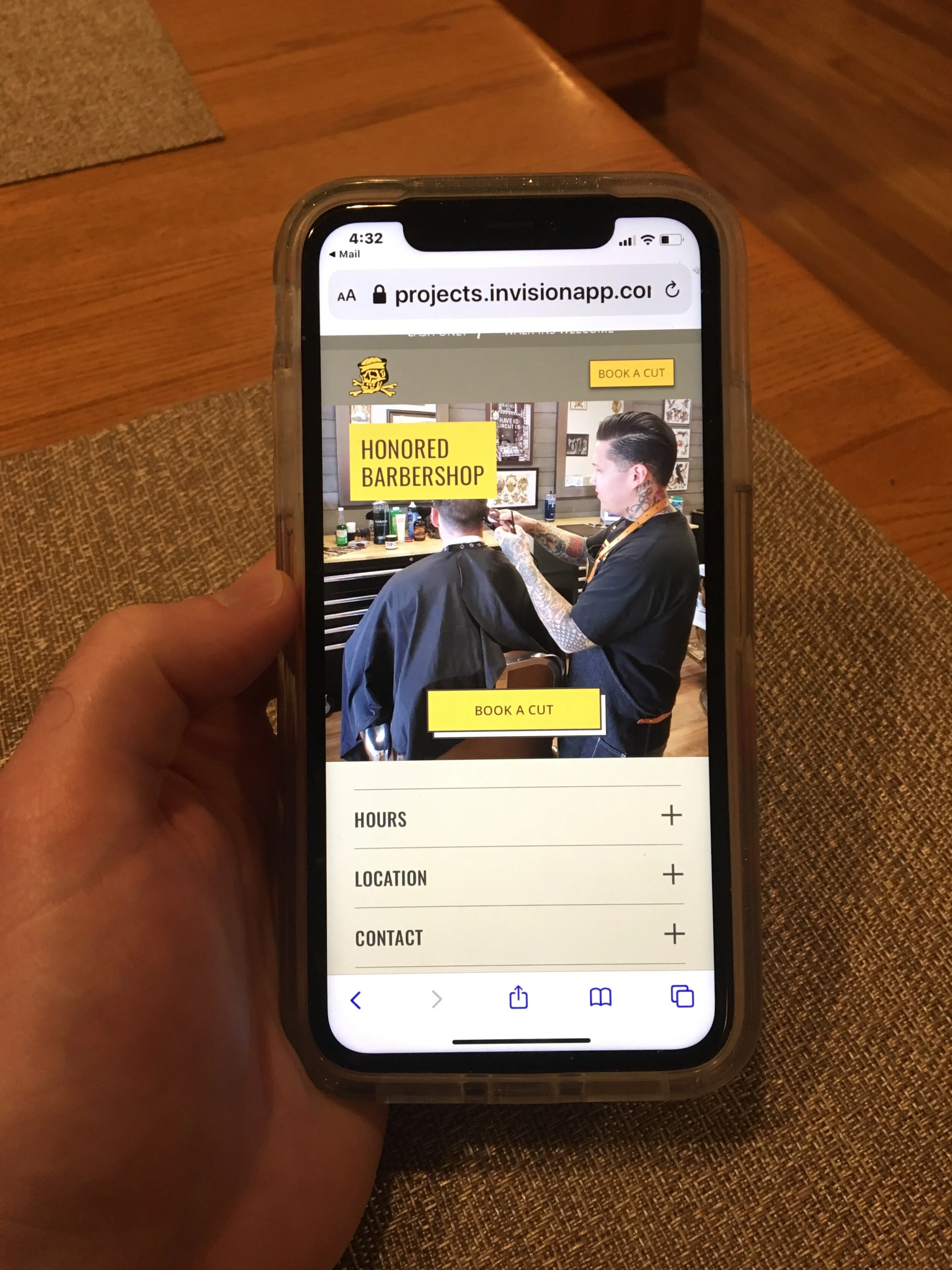
Users preferred the mobile site to the desktop version.
Users were easily able to navigate the site and find the desired information on both the mobile and desktop versions.
The layout of booking process needs to be more visible for clients. Testers thought that after making a selection for each booking step, the site would have automatically brought them to the next section, while they were intended to scroll down to reach the next section.
There were minimal errors during testing which led to minimal changes made during the iteration phase.
Iterations

Changes
Improve the top-to-bottom visibility of the booking flow by condensing each section once the user has made a selection. This change allows users to view the entire booking process and reduce any confusion of how to book a haircut.
Add a ‘Reviews’ and ‘Gallery’ section to the mobile site within the accordion menu.
Change the titles of ‘reviews’ to Yelp and ‘gallery’ to Instagram to add clarity of what each button leads to.
Add visual cue indicators for the calendar element to help users identify what date(s) are past, current or selected.
Make a separate confirmation page outside of the booking flow.
Future Improvements
Review with Jon (owner) and make additional changes
Set up a photoshoot to take high quality photos intended for the site
Key Learnings + Next Steps
Key Learnings
Regardless of the business, their website can always be improved. Research can conclude that a website is not the primary channel the customer tends to favor. However, that shouldn't stop a business from having a strong website. There are dozens of reasons that businesses have websites, despite the fact that another channel might be the primary channel (Google, Instagram or otherwise) from which customers obtain information. UX principles can still be applied to a business’ website, even when it’s not the number one resource of the customer.
This helped me better understand the mind of the customer. Instead of focusing on the channel, I focused on the information which customers found most relevant. Asking questions like: What are customers looking for on these other channels? This had a big impact on what I included on the redesigned website.
It’s important to make and work with assumptions in a limited amount of time. Since I was limited to 2-weeks for this project, I would’ve like to test which design (multi-page vs. single page) worked better, but I had to move forward to deliver the project within the allotted timeframe. The assumption I made was ultimately tested during the usability tests in which users mentioned how they enjoyed the simplicity of the single page website.
White space is your friend. While first designing this site I used a dark background color. After the initial design, everything felt heavy. Not to mention, I also reduced padding throughout the site so that it wouldn’t be too long and not deliver information to the users as fast as they wanted. After the initial design, I changed from a darker background to a lighter background and increased the white space and padding throughout the site. This gave the site a much more balance feel and greatly improved the visual hierarchy.
Next Steps
Upon completing this project I plan to present my changes/suggestions to Jon (business owner).
Stay tuned for updates on what changes are implemented!
Get in touch!
If you would like to get in touch with me about this project, working together, or just want to say hi, hit the button below!